How to Style Dark Interior Design Like a Pro

Dark interior design has a reputation problem. It gets filed under “dramatic” or “risky” by people who haven’t thought through what makes it work, and then dismissed as a choice only for moody apartments or Instagram aesthetics. After eight years of designing residential interiors across a full range of client budgets and style preferences, I have a different take: dark is one of the most forgiving palettes to work with, if you understand the underlying logic.
The defining principle is not the color itself. It’s what dark surfaces do to light, scale, and material perception in a room. Get that part right, and the rest follows naturally.
The Color Palette Is Not What You Think
Why “Just Paint It Dark” Fails Almost Every Time

The first mistake most people make with dark interior design is treating “dark” as a single category. It isn’t. Deep charcoal, navy, forest green, burgundy, and warm espresso brown all look dark from a distance, but they behave completely differently in a space. Charcoal on north-facing walls in a Chicago winter looks cold and receding. The same space with a deep warm brown feels enclosed in a deliberate way, like a library room that pulls you in rather than pushes you out.
I’ve seen this mistake repeated across client projects: someone picks a paint chip that looks great in the store, applies it to all four walls, and ends up with a room that feels oppressive rather than intentional. The issue is almost never the color saturation. It’s the undertone. A color with a blue undertone cools a room significantly. A color with red or yellow undertones warms it. In dark design, that difference is amplified because there is less ambient light to correct for temperature shifts.
The key principle here is that dark colors are not interchangeable in the way that light neutrals often are. With light colors, an off-white on north-facing walls functions acceptably in almost any light condition. With dark colors, the undertone determines whether the room feels intentional or just heavy. Test paint samples at least 12 inches by 12 inches, in the actual light conditions the room gets in the morning, afternoon, and evening before committing.
Two colors I recommend to clients who want dark but are nervous about it: Farrow and Ball’s “Mole’s Breath” (a warm greige-brown in the deep range) and Benjamin Moore’s “Black Panther” (a deep warm black with enough brown to avoid the flat, stark quality of a pure black). Both sit in a range where the room reads as dark without crossing into austere. Both also photograph well, which matters when you want the space to look as good in daylight as it does after dark.
Lighting Is the Whole Game
The Three-Layer System That Actually Works in Dark Rooms

This is the thing most dark interior design guides miss: dark walls do not cause bad lighting. Insufficient lighting causes bad lighting, and dark walls make it immediately visible. If a room has only overhead lighting and you paint the walls dark, it will feel like a basement. That is not a dark design failure. It is a lighting design failure that the dark walls exposed.
The correction is straightforward in principle. You need three categories of light working at the same time: ambient (general room illumination, usually overhead), task (directed light for reading, cooking, or working), and accent (wall sconces, picture lights, under-cabinet strips, anything that creates visual interest in the space). Most residential rooms that struggle with dark walls are running on ambient only, and no color on the walls is going to fix that.
On a ranch-style home project in Montana, I worked with a living room that had a vaulted ceiling, dark charcoal walls, and one central pendant. The room felt oppressive. We added two floor lamps flanking the sofa, plug-in wall sconces on either side of the fireplace, and low-voltage strip lighting above the kitchen pass-through. The wall color didn’t change. The room went from difficult to genuinely warm and functional through the whole day. That is what layered lighting actually does in a dark interior design context.
Dimmer switches are worth the installation cost on every circuit in a dark room. The ability to drop ambient light to 30% in the evening while keeping accent lights at full output is what separates a room that functions well throughout the day from one that only looks good in photographs. I’ve skipped this detail on projects where the budget was tight and always recommended adding it later. It is easier and cheaper to install dimmers during any other electrical work than as a standalone project.
One technical detail worth getting right: bulb color temperature. 2700K (warm white) is almost always correct in a dark interior. It works with the warmth of dark walls rather than against it. Anything above 3000K introduces a bluish cast that flattens the depth of dark colors and makes a room feel clinical rather than intentional. If you are working through the balance principles that make dark design function, bulb temperature is where to start before touching anything else.
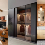
Materials and Furniture in a Dark Space
What to Prioritize When Selecting Furniture for Dark Rooms

Most people assume dark rooms need light furniture to prevent feeling heavy. That is the conventional read, and in my experience, it is usually the wrong call. What a dark room actually needs is textural contrast, not tonal contrast. A room with dark charcoal walls, a dark walnut dining table, and dark linen upholstered chairs works well if those surfaces have distinct textures: matte wall, open-grain wood, woven fabric. Each surface is absorbing light differently, and that difference is what the eye registers as depth. A room with dark walls, white furniture, and minimal texture often ends up looking like a high-contrast graphic rather than a designed space.
Material choices I prioritize in dark interior design projects: walnut (open grain, warm brown tones), blackened steel (matte finish, structural weight), velvet upholstery (light-absorbing in a way that registers as richness), and natural stone in dark or heavily veined varieties. What I avoid: high-gloss lacquered furniture in all-dark rooms. The reflective quality in that combination looks unresolved. One finish should dominate; when gloss and dark compete, neither wins.
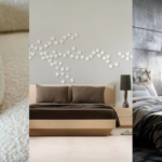
For clients working with existing furniture they want to keep, the fastest way to shift a dark room is through soft goods. A wool throw in dusty rose on a charcoal sofa, a sisal rug under a walnut coffee table, a linen table runner on a dark dining table. These additions cost significantly less than new furniture and accomplish the textural work that makes a dark room feel grounded rather than closed in.
Accessories That Hold Their Own Against Dark Walls

Accessories in a dark room need to be chosen with more intention than in a light room. In a light room, almost anything works because the neutral backdrop accommodates variety without demanding coherence. In a dark room, each accessory choice either reinforces the design logic or works against it. Artwork should go light or very light against dark walls, not mid-tone. Mid-tone art on dark walls disappears. Ceramics in matte finishes hold up better than glossy pieces. Brass and copper hardware looks warmer and more deliberate than chrome, which tends to look clinical against dark backgrounds.
One category that consistently performs well: plants. Deep green tropical foliage (fiddle leaf fig, monstera, pothos) against dark walls creates a kind of depth that photography rarely captures accurately. I’ve used this approach on constrained budgets when a client needed visual impact without new furniture. Matte black planters, mid-size tropical plants, dark wall behind. The result looks considered, and the total cost for the plants and planters is usually under $200.
Contrary to what appears on most dark room inspiration boards, mirrors are not the automatic solution. The logic is that mirrors bounce light and prevent a dark room from feeling small. In practice, a mirror placed on a dark wall usually functions as a visual interruption rather than a resolution. I would rather see a large-format print in a light frame, or a gallery wall with consistent frame color, than a mirror used as a corrective measure for a room that needs better lighting.
Dark Design Styles Worth Understanding
Dark Minimalism: The Restraint That Makes It Work

Dark minimalism is the most technically demanding version of dark design, and the one that fails most often in residential applications. The principle is sound: a dark, stripped-back space with very few objects, each chosen deliberately. The problem is that it requires absolute control over material quality, because in a minimalist dark room, every surface is visible and nothing can be hidden behind visual complexity. A cheap cabinet door, a slightly misaligned baseboard, a power strip that wasn’t routed into the wall: all of it shows immediately and without mercy.
When I advise clients on this direction, I tell them to reduce the object count to what they can afford to execute properly, rather than filling out the room with budget pieces. Five well-chosen objects in a dark minimalist space will always outperform twenty items that were compromises on quality. The color palette in this approach typically runs to black, charcoal, and one warm material (usually wood) for tactile relief. The space requires more planning time and usually a higher per-item budget, but fewer items overall.
The approach borrows from Japanese aesthetic principles, particularly the idea that negative space carries weight equal to positive space. If you’re interested in how that logic translates across different design contexts, Zen Japanese interior design covers several overlapping principles, particularly around restraint and material honesty.
Gothic Dark: When Ornamentation Is the Structural Logic

Gothic dark works on the opposite principle from minimalism: the accumulation of detail creates the effect, not the reduction of it. Ornate woodwork, heavy fabric, repeated motifs, layered textiles. The historical reference is genuine here: Gothic architecture was designed to produce a sense of awe through density of detail, and the interior design tradition draws from that same logic. This is not a style where restraint is rewarded. Restraint in a Gothic dark room just looks unfinished.
In residential applications, you don’t need to reproduce a medieval hall to get the effect. The core elements are: dark velvet or brocade on at least one upholstered piece, a dark wood piece with carved or pronounced detail (even a single console table works), and pattern repetition through textiles or wallpaper. A damask wallpaper in deep navy, a tufted sofa in charcoal velvet, and dark wood trim pulls the visual language together without requiring a full renovation. The key is pattern repetition: the style gains authority through repetition of motif, not from any single dramatic object.
For a full breakdown of how this style developed and how to apply its defining elements in a modern home, the Victorian Gothic interior design guide covers the historical foundations and practical application room by room.
The Practical Reality of Living with Dark Walls
What Dark Surfaces Actually Do Over Time

Dark paint on walls holds up well in low-traffic areas and shows wear in high-traffic ones. This is the same behavior as light paint, just more visible. A dark wall in a hallway will show scuffs and fingerprints relatively quickly. A dark wall in a living room behind a sofa will look fine for years. Plan the application accordingly rather than treating dark as uniformly high-maintenance across the entire home.
Dark hard surfaces, specifically countertops, cabinet fronts, and flooring, show dust and water spots more readily than light equivalents. If you’re applying dark design to a kitchen or bathroom, factor in the cleaning requirement honestly before committing. Matte black cabinet hardware and matte-finish surfaces generally require less maintenance than high-gloss in the same color, because water spots don’t show on matte the way they do on polished gloss. This is a practical trade-off worth understanding before the cabinets are ordered.
The heat absorption concern is real but often overstated. Dark interior walls absorb more radiant heat from sunlight entering through windows, but in a climate-controlled home the effect is minimal. In an unconditioned space (a sunroom or screened porch with dark walls and direct sun exposure), the perceived temperature can increase noticeably in warm weather. For standard rooms with HVAC and normal window coverage, this is not a meaningful factor in the decision. For a room-specific look at how dark design plays out, the post on making a dark bedroom work covers the bedroom context in detail, where the same color and lighting principles apply.
Frequently Asked Questions
Does dark interior design work in small rooms?
Yes, but it requires more attention to lighting. Dark walls in a small room without layered lighting will feel enclosed. The same room with floor lamps, accent lighting, and a dimmer on the overhead will feel intentional rather than cramped. Scale of furniture also matters: lower-profile pieces in a small dark room reduce visual heaviness.
What colors qualify as dark interior design?
Any color dark enough to absorb significant light rather than reflect it: deep charcoal, navy, forest green, burgundy, espresso brown, plum, and warm black. The category is defined by light behavior, not by a specific hue. Undertone matters as much as depth: a warm dark color reads differently than a cool one of the same saturation.
How do I prevent a dark room from feeling like a cave?
Layer your lighting. Ambient-only lighting in a dark room creates exactly that effect. Add floor lamps, wall sconces, and accent lighting to distribute light sources around the room. Dimmer switches on all circuits let you adjust the ratio of ambient to accent as daylight changes throughout the day.
Are dark interiors harder to maintain than light ones?
In some situations, yes. Dark paint in high-traffic areas shows scuffs more visibly. Dark hard surfaces show water spots and dust more readily than light ones. In low-traffic rooms and on walls not subject to direct contact, dark surfaces hold up as well as light ones. Matte finishes on both paint and hardware reduce visible maintenance compared to gloss.
Can I mix dark and light elements in the same room?
Yes, and in most cases it produces a better result than committing entirely to dark. The key is textural contrast rather than purely tonal contrast. Dark walls with a mix of dark and mid-tone furniture, differentiated by material texture, works more reliably than a strict light-on-dark or dark-on-dark approach.