Interior Design Basics: What Designers Know That Most People Don’t

Most people approach interior design backwards. They pick a sofa they love, find a rug to match, add a lamp, and then wonder why the room still feels off. I’ve been a residential designer based in Chicago for over a decade, and this is the single most common pattern I see in first-time clients: individual good taste combined with no framework. The room becomes a collection of items rather than a space.
Understanding the core concepts of interior design basics, before buying a single piece of furniture, changes everything. It doesn’t require years of school. It requires about twenty minutes of actually paying attention to how rooms work. This is that twenty minutes.
The Elements of Design: Your Building Vocabulary
Before principles, there are elements. These are the raw materials of any design decision, and understanding them gives you a language for why certain rooms work and others don’t.
Color Does More Than You Think
Color is the first thing most people reach for, but usually for the wrong reasons. The question isn’t “do I like this color?”, the better question is what that color is doing to the room’s light and perceived scale. I’ve watched a client fall completely in love with a deep charcoal gray wall, only to see it drop the visual ceiling height by about two feet. The actual ceiling didn’t change. The perception of it did entirely.
In a 9×12 bedroom I designed in Lincoln Park, I used a dusty sage for three walls and pulled a deeper terracotta into a single accent wall behind the bed. The result was a room that felt layered without feeling small. Cool tones pull walls back; warm tones advance them. This is measurable physics, not just taste. Understanding color psychology before choosing paint saves a lot of expensive repaints.
Line: The Direction Your Eye Travels
Lines are the grammar of a space. Horizontal lines, low-profile furniture, long shelving runs, slow the eye and make rooms feel wider and more restful. Vertical lines, tall bookshelves, floor-to-ceiling curtains, pull attention upward and add perceived height. Diagonal lines introduce energy and movement.
Most rooms contain all three, but the useful question is which one dominates. In most modern living spaces, horizontal lines should lead. That’s why low-profile sofas and floating TV units have become so persistent in contemporary design: they reinforce calm width rather than visual chaos.
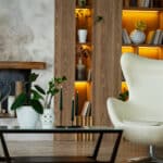
Texture: The Layer Most Rooms Are Missing
Texture is the element that separates rooms that feel designed from rooms that merely look decorated. A neutral palette with no texture variation goes flat. Everything sits at the same visual weight, and the room reads like a furniture showroom. A neutral palette with a wool throw, a linen sofa, a reclaimed wood coffee table, and a ceramic lamp base? Now you have something with dimension.
Mixing textures is less about matching and more about contrast: smooth next to rough, matte next to gloss, soft next to hard. The pairing creates depth that a single-texture room can’t achieve regardless of how expensive the individual pieces are.
Form, Space, and Why Every Object Has a Job
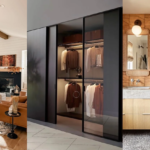
Form refers to the three-dimensional shape of objects in the space. Rooms with forms that don’t relate to each other, round table, hard-cornered sofa, angular pendant, organic sculpture, can feel restless without being identifiably wrong. The key principle here is synergy: your furniture’s forms should share enough visual DNA to read as a family, even if they’re not a matched set.
Negative space, the empty areas of a room, is also a form. Deliberately leaving parts of a wall bare or a corner open is a design decision, not a failure to fill the space. In practice, I often tell clients that the last 20% of the room should stay empty. The room needs room to breathe.
The Principles That Separate Good Rooms from Great Ones
Elements are what you work with. Principles are how you work with them. Balance in interior design, rhythm, harmony, and proportion aren’t stylistic preferences, they’re structural laws that apply regardless of what aesthetic you’re working in.
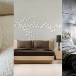
Symmetrical Balance: The Easy Win

Symmetrical balance, the same elements placed on either side of a central point, is the most immediately satisfying and the easiest to execute. Two matching nightstands flanking a bed, two chairs facing each other across a coffee table. It reads as deliberate and calm. In residential work, symmetry handles master bedrooms and formal living rooms well. It’s reliable, but it can feel static if nothing else in the room moves.
Asymmetrical Balance: Where Rooms Get Interesting

Asymmetrical balance is harder to pull off but usually more interesting to live with. A tall floor lamp on one side balanced by a lower grouping of side table, books, and plant on the other. Same visual weight, different elements. The key principle: visual weight doesn’t mean size. A small, dark object can balance a much larger light one. This is what people mean when they say a room looks “curated” rather than “matched”, asymmetrical balance done well has that quality.
Radial Balance: The Strong Anchor

Radial balance arranges elements around a central point. In residential spaces, this usually means a strong pendant light or statement ceiling fixture anchoring a dining table, or a circular rug defining a seating area. When it works, it works decisively, the room has a clear center of gravity. When it doesn’t, the room feels like it’s spinning around a single piece.
Rhythm Through Repetition

Repetition creates rhythm. Using the same finish, brushed brass, for example, in drawer pulls, curtain rods, and a side table leg gives the room a through-line that the eye follows naturally. The repetition doesn’t need to be loud or obvious. In fact, the best repetitions are the ones you feel but can’t immediately identify. A room where every material appears only once reads as random. One where two or three materials recur reads as intentional.
Rhythm Through Alternation and Progression

Alternation switches between two elements to create a more active rhythm, black and white throw pillows alternating down a sofa, or wood and metal frames on a gallery wall. This needs more restraint than simple repetition. Too many alternating sequences in one space creates visual noise instead of rhythm.

Progression, gradually increasing or decreasing a quality, is the most sophisticated rhythm technique. Moving from lighter to darker cushions along a sofa, or from smaller to larger objects on a shelf. In open-plan spaces I use progression to transition between zones without hard visual dividers. A color that lightens as it moves toward the kitchen side of a combined living-dining area signals a zone change without a wall.
Harmony and Contrast: They Work Together, Not Against Each Other
Harmony in interior design means the elements feel like they belong together. Contrast is what gives harmony any interest at all. A room with only harmony becomes dull, every piece quietly agrees with every other piece, and nothing holds your attention. A room with only contrast becomes exhausting, too many competing focal points and the eye doesn’t know where to land.
The version I see go wrong most often: too many accent colors, or accent pieces that have no visual relationship to anything else in the room. My working rule with contrast: one strong contrast per room, executed deliberately. A single dark wall in an otherwise light room. Not three competing statements at once. Rooms need one thing to look at first.
Proportion: Where Beginners Make the Most Expensive Mistakes

Relative proportion is the relationship between elements in the room. A small side table beside a hulking sectional sofa is a proportion problem. The eye reads it as wrong even when the person can’t explain why. Every piece of furniture carries visual weight proportional to its size and the depth of its color, and each piece needs to relate sensibly to what’s around it.

Absolute proportion compares against standard measurements, the kind that have been calibrated over decades against how people actually use furniture. A coffee table should sit within one to two inches of the sofa seat height. Standard sofa seat depth is 20-22 inches; anything significantly deeper starts to feel like a mattress. These aren’t arbitrary rules. They’re ergonomics that also happen to look correct because they’re grounded in human scale.

Scale refers to how an element relates to the room itself. The most common scale mistake I correct in client projects: rugs that are too small. A rug doesn’t need to be contained under the furniture, it needs to be large enough to anchor the seating area as a whole. In a standard living room, a 9×12 rug is typically the minimum. I’ve worked with clients who had a large sectional sitting on a 5×7 rug. The furniture looked like it was floating off the edge, which reads worse than no rug at all.
Color Theory in Practice
Color psychology in design is more predictable than people expect. Cool blues and greens genuinely lower perceived temperature and create mental calm, this is measurable, not just anecdotal. I’ve specified deep navy and forest green accent walls in home offices specifically because clients needed an environment that felt focused rather than social. Warm terracottas and amber-toned neutrals do the opposite: they invite conversation and make people want to stay. This is why they’re persistently dominant in dining rooms regardless of decade or trend.
Complementary Schemes: High Contrast, High Risk

Complementary color schemes, colors opposite each other on the wheel, create maximum contrast and visual energy. The approach that works: use one color as the dominant 70% and its complement in small doses as accents and accessories. The approach that doesn’t: applying both colors in roughly equal amounts. That creates competition, not drama.
Analogous Schemes: The Easier Win

Analogous schemes, colors adjacent on the wheel, are easier to execute and more restful to live with long-term. A living room in warm whites, warm taupes, and warm beiges is an analogous scheme. It reads as cohesive without requiring much management. The important caveat: analogous schemes go flat without texture variation. If everything is the same tone and the same surface finish, the room disappears. Varied textures are what make a tonal palette feel rich rather than bland.
Triadic Schemes: Use With Editing

Triadic schemes use three colors evenly spaced on the wheel. The version that tends to fail: treating all three as equal players. The version that works: one clearly dominant color covering most surfaces, one secondary color appearing in soft applications like a patterned textile, and one used sparingly as a small accent. At that point, the triadic relationship gives the room depth without the chaos of three competing tones.
Lighting: The Principle Most Clients Treat as an Afterthought
This is the opinion that surprises most people: I consider lighting more important than furniture selection. You can put mediocre furniture in a well-lit room and it will look intentional. You can fill a room with well-chosen pieces under bad lighting and they’ll look flat and lifeless. Lighting is the single most underinvested area in residential design, and it’s also the one that’s hardest to fix after the fact.
The three-layer system, ambient, task, accent, is a principle, not a formula. Ambient lighting provides overall illumination; I use recessed downlights on dimmers as the baseline in nearly every project. Task lighting handles specific activities: pendants over a kitchen island, an adjustable arm lamp at a desk, a floor lamp positioned at shoulder height beside a reading chair (not beside the table, beside the chair, that’s where the light needs to land). Accent lighting is where personality enters: directional spots on artwork, uplighting behind a large plant, a lit display shelf.
On the product side: I’ve been specifying Lutron Caséta dimmers for about four years. The difference between static overhead lighting and dimmer-controlled ambient light in a living room is the difference between an office and somewhere people actually want to sit. The Caséta system works with most standard fixtures and installs without rewiring, around $60-80 per switch, and among the highest-return improvements you can make to any existing room.
Space Planning: Before You Buy Anything
Space planning happens before furniture selection, not after. The sequence that works: define the zones first, seating area, dining area, circulation paths, then identify the natural traffic flow through the space, and then position furniture to support that movement rather than interrupt it.
The most useful test I use with clients: walk through the room in the most natural path from door to door with your eyes half-closed. Where does your path feel constricted? Where do you naturally angle to avoid something? Those are the circulation problems. The room’s furniture should never require a person to navigate around the seating area to move between the entry and the kitchen.
One of the most persistent mistakes in living room arrangements: the sofa pushed against the wall. It feels intuitive, it seems to maximize space, but it actually compresses the usable zone. Floating the sofa 18-24 inches from the wall creates a more defined conversation area and, counterintuitively, makes the room feel larger. I’ve had to show this to clients using tape on the floor before they believe it. Once they see the floating arrangement in place, they don’t go back. The emphasis in interior design shifts from wall-hugging habit to deliberate spatial planning.
The Design Process: What Actually Happens in a Real Project
A real design process has three stages, and the order matters. Research and analysis comes first: understanding the room’s proportions, the natural light conditions throughout the day, the client’s actual habits (not their aspirational habits, whether they genuinely sit in the reading chair or leave it for guests). Skipping this phase produces beautiful rooms that nobody lives in.
Concept development follows: color direction, material palette, furniture profile. I use physical mood boards rather than digital ones where possible, because the difference between a paint chip and a painted wall, between a fabric swatch and a full sofa, is enormous. Concept approval is where most client-designer miscommunications happen, which is why this phase needs the most time.
Execution is where the concept meets reality. This is where you find out whether the sofa you specified actually fits through the apartment door (it occasionally doesn’t), whether the flooring color shifts dramatically under the room’s specific natural light, and whether the ceiling fixture you ordered for the dining room is scaled correctly for the table. Eclectic design approaches require particularly careful execution, the more varied the elements, the more precisely they need to be managed at installation. Having a solid concept going in is the only thing that keeps the execution phase from becoming improvisation.
Frequently Asked Questions
What are the basic elements of interior design?
The seven core elements are space, line, form, light, color, texture, and pattern. Understanding how these interact is more useful than knowing any specific style, because the elements apply regardless of aesthetic direction.
Which design principle is most important for beginners?
Proportion and scale. Most beginner mistakes come from furniture that’s the wrong size for the room or for each other. Getting scale right makes nearly everything else easier, and getting it wrong undermines even expensive, well-chosen pieces.
How do I choose a color scheme that works?
Start with the room’s light conditions, north-facing rooms need warmer tones, south-facing rooms can handle cooler ones. Then choose an analogous or complementary scheme, keeping one color clearly dominant. Limit your palette to three colors in varying proportions rather than treating them equally.
What interior design mistakes are most common?
Rugs that are too small, lighting that isn’t layered (relying on a single overhead source), furniture pushed against walls, and accent colors with no visual relationship to the main palette. These four mistakes appear in most rooms that feel ‘almost right’ but not quite.
Do I need to hire a designer to apply these basics?
No. The principles in this guide apply whether you’re working with a designer or on your own. A designer adds value in execution, sourcing, space planning, vendor relationships, but the conceptual framework is available to anyone willing to learn it. Understanding design basics also makes you a better client if you do decide to hire someone.