Rustic Scandinavian Living Room: Soft Wood and Lived-In Calm

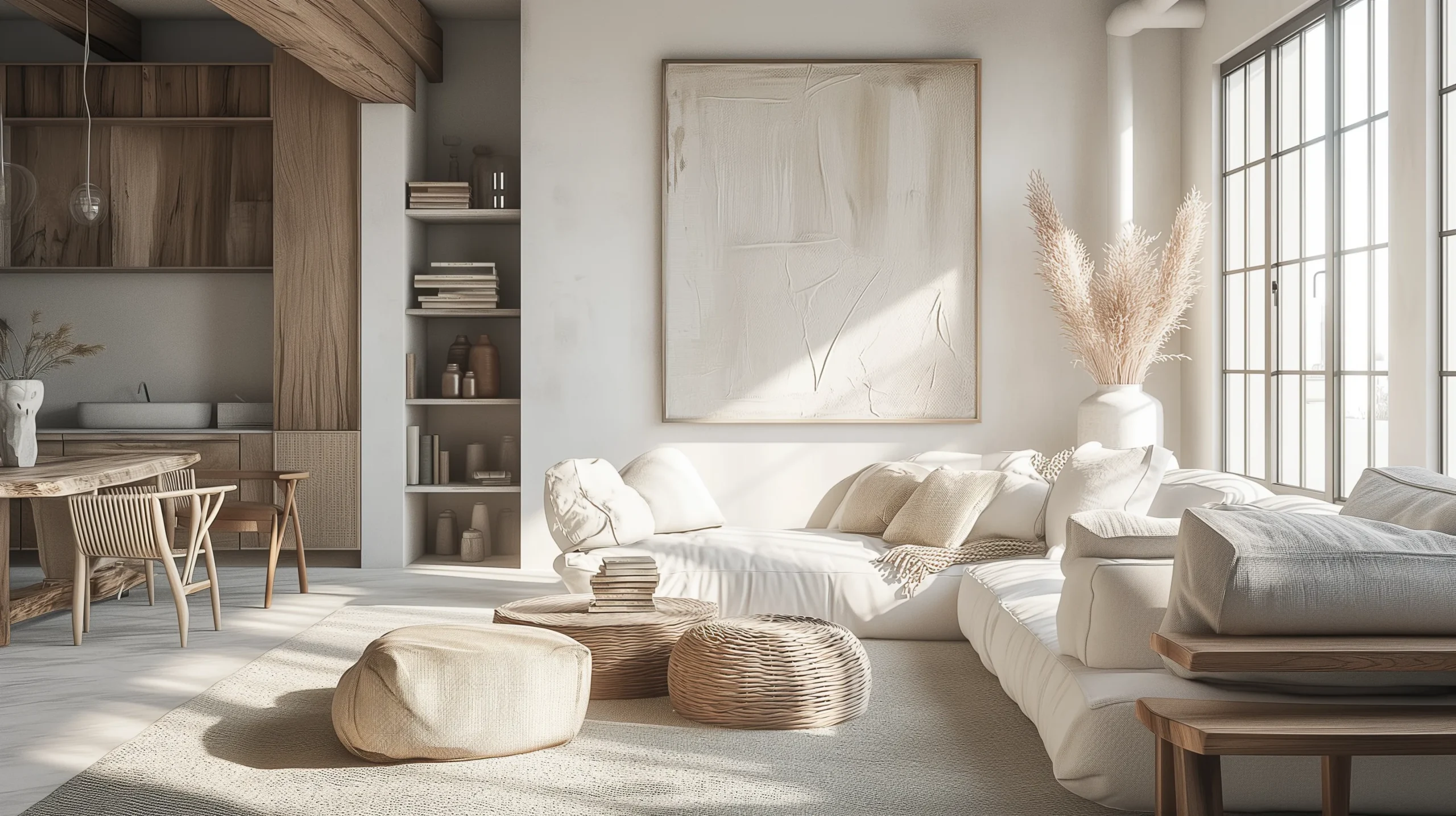
This style is easy to get wrong by stopping at pale wood, white walls, and minimal furniture. All the Scandinavian elements, technically. A living room like that can still feel like a waiting room in the morning and a furniture showroom at night. The problem is not the pieces. It is collecting Scandinavian details without the rustic half. The version that works looks like this: rough-hewn beams, a worn linen sofa, candles on every surface, and a warmth in the light that makes you want to sit down and stay.
The living room is where this style works best and where it most often goes wrong. It has to serve morning coffee, evening reading, guests, quiet nights, actual life all at once. What follows is what that means in practice: the choices that actually move the needle are furniture scale, layered light, and fewer objects left on the table.
What This Style Actually Is (Before You Buy Anything)
Most people assume rustic Scandinavian is just cozy Scandinavian. That assumption skips the real split. Standard Scandinavian design values refinement: smooth lacquered surfaces, precise joinery, minimal visible grain. The rustic version actively values imperfection. A knot in a floorboard is a design element. A worn patch on a linen cushion means the space is being used, which is the whole point.
The Danish concept of hygge is more practical than the word suggests. It is not an aesthetic mood board. It is a set of physical conditions: soft pooled light instead of overhead brightness, textiles you can actually feel, clear surface space near every seat to put down a cup of tea. Rooms that feel right in this style are rooms where someone thought through what makes a person feel at ease, not just what photographs well.
The Two Design Languages Working Together
Scandinavian minimalism provides the structure of the room: a neutral palette, clean-lined furniture, deliberate negative space. The rustic layer is what fills that structure with warmth: rough wood, handmade ceramics, natural fibers with visible texture. One without the other fails in a living room context. Pure minimalism reads sterile in a space people actually spend time in. Rustic warmth without the restraint tips into clutter fast. The two languages work because each is doing something the other cannot. For more on how visual balance functions in interior spaces, the post on balance in interior design covers the underlying principle in detail.
Getting the Color Palette Right
White Is a Starting Point, Not an Ending Point
The palette starts with white or off-white walls. That part most people get right. Where it goes wrong is treating white as a neutral non-choice and then wondering why the room feels flat. In this style, the specific white you choose matters more than almost any other decision. Cool whites with a blue or gray undertone make pale wood furniture look like it was left there by accident. Warm whites make the same furniture look intentional.
I tested this directly. In a previous rental, I painted two accent walls: one in a cool bright white, one in a warmer cream. I looked at both for a week before deciding. The cream wall made my pale oak side table look like a deliberate choice. The cool white made it disappear into nothing. For this style, I keep coming back to Benjamin Moore’s White Dove (OC-17) and Sherwin-Williams Alabaster (SW 7008). Both have a slight yellow-pink undertone that warms the room without reading as yellow. Both make natural wood furniture look like it belongs. The paint shift cost forty dollars and did more for the room than anything I purchased that year.
When to Add Dark Accents (and How Much)
Neutral palette does not mean monochrome. Dark elements give the room structure and prevent the whole space from looking washed out. A ratio worth using: roughly 70 percent warm white or pale gray, 20 percent wood tones, and 10 percent dark grounding elements. That last 10 percent does more visual work than people expect. In a living room, that dark accent is usually the coffee table finish, pendant light fixtures, or a single large mirror with a dark frame. What to avoid: high-gloss black finishes. They fight the rustic quality of the room. Matte or oiled surfaces integrate far better.
Furniture Choices That Make or Break This Look
The Sofa Decision Is Your Most Consequential Call
Everything else in this style can be adjusted at low cost. The sofa is the anchor, and getting it wrong is expensive to undo. Two things matter: a low profile (seat height around 15 to 17 inches) and natural upholstery fabric. Linen and cotton blends in oatmeal, cream, or warm gray are the practical center of this aesthetic. Leather can work here, specifically full-grain leather in tan or cognac, but a dark leather sofa creates too much contrast and competes with every other element in the room.
The budget version of this: IKEA’s KIVIK and EKTORP both work when slipcovered in natural fabric. An EKTORP in a natural linen slipcover holds up in daily use for years. It is still the piece people ask about most when they visit. The slipcover cost around ninety dollars. If anyone tells you this look requires expensive furniture, they are wrong. What it requires is the right fabric on furniture with the right silhouette, which is a different problem and a much cheaper one.
Wood Species Make a Bigger Difference Than You Would Expect
Most people choose wood furniture based on price and general style. In this aesthetic, the species and finish matter more than in almost any other. Pine and spruce, pale almost-white woods, read as distinctly Nordic. Oak in a natural or lightly oiled finish sits right between rustic and refined. Darker stains and walnut start pulling toward American farmhouse rather than Scandinavian. The principle: visible grain in a medium tone. Not so pale it disappears against the walls, not so dark it takes over.
In a living room, the pieces where wood character shows most clearly are the coffee table and any open shelving. A raw-edge coffee table in pale oak, open shelves in light pine. Budget-friendly options at IKEA, Article, and World Market all work; the key is looking for pieces where the grain is visible rather than hidden under a thick stain.
Lighting: The Part That Changes Everything
Why One Overhead Light Will Kill the Mood
The usual miss shows up in the first week: a single overhead and nothing else. One fixture plus reasonable daylight, with no extra warmth at night, leaves the room looking like a waiting room by evening. In a rustic Scandinavian living room, layering light sources is not optional. It is what creates the atmosphere the style depends on. A pendant light for general ambient use, a floor lamp with a rattan or linen shade in one corner, a table lamp near the sofa, and candles on available surfaces. Scandinavian countries have long dark winters and a genuine cultural tradition around candlelight. The design heritage reflects that. Rooms that feel right in this style always have warm, pooled light rather than even overhead brightness.
Gallery Walls Done the Rustic Scandinavian Way
Contrary to what most Pinterest boards show, a gallery wall in this style should not look full. Overfilling a gallery wall is one of the most common mistakes I see in this aesthetic. Fifteen small frames competing for wall space creates visual noise rather than character. I would argue for five to seven pieces at most, with deliberate empty space between them. Black frames on white walls integrate naturally. So does unfinished pine or simple bleached wood framing.
Content that belongs here: botanical prints, black-and-white landscape photography, simple line drawings. Colorful abstract art fights the palette. When in doubt, fewer larger pieces over more smaller ones. The space between the frames matters as much as the frames.
Plants and Natural Elements: What Actually Belongs Here
Which Plants Fit the Aesthetic (and Which Fight It)
Plants in this style should not look tropical or maximalist. Large-leafed monstera read more Bohemian than Nordic in this context. I lean toward snake plants (upright and structural), eucalyptus branches in a simple matte ceramic vase, a fiddle leaf fig if you have the ceiling height, or small potted herbs near a window. The point is greenery that looks like it belongs inside a house in winter. A few dollars of eucalyptus from the grocery store in an off-white ceramic vase does the job. The interior plant design guide on this site covers placement and species choices in more detail.
Furniture Arrangement That Gives the Room Space to Breathe
The layout principle in Scandinavian design is conversation-first: furniture arranged to face each other, not all pointed at the television. In practice, that means a sofa and two chairs, or a sectional, grouped around a central coffee table with clearance on all sides. The first thing I would change in most living rooms I visit is the arrangement. Pulling furniture away from the walls and creating a tighter, more deliberate seating group immediately makes the space feel considered in a way that better furniture alone cannot replicate. The Scandinavian interior design guide on this site covers the broader thinking behind layout conventions if you want more context.
The Accessories Layer: Less Really Is More Here
Accessories That Have a Job
The accessories rule in this style is firm: if something does not have a purpose, even a small one, it probably does not belong here. A ceramic bowl on the coffee table is fine if it holds remotes or a candle. A decorative figurine with no practical function fights the aesthetic. Cutting the accessories down usually improves the room right away, and a second pass later often helps again. The impulse to add more is almost always wrong in this style. Giving in to that impulse tends to look wrong within a week, once the new object has no job.
Textures that work: chunky knit blankets (IKEA wool throws for budget; Faribault Woolen Mill for something that lasts a decade), linen cushion covers in warm neutrals, jute or wool rugs with a natural irregular weave. The rug deserves more attention than people give it in a living room. It defines the seating area and anchors the whole arrangement. This is one place spending more upfront pays off.
The Hygge Layer: Slowing Down the Space
Hygge in a living room means building the physical conditions where slowing down feels natural. Candles on every available surface (unscented or lightly scented beeswax candles burn cleaner and last longer than most paraffin alternatives), a reading corner with a wool blanket within reach, and enough clear surface space near every seat to put down a cup of tea without rearranging anything first. None of this needs to be expensive. All of it needs to be deliberate.
Something I keep noticing: this style genuinely rewards imperfection. A worn spot on a linen cushion, a coffee ring on a natural wood table, fingerprints on a matte ceramic vase. These things make the space feel lived in rather than staged. The Scandinavian design tradition has always been about spaces built for actual living, not spaces built for photography.
Pulling It All Together
What a Finished Room in This Style Actually Looks Like
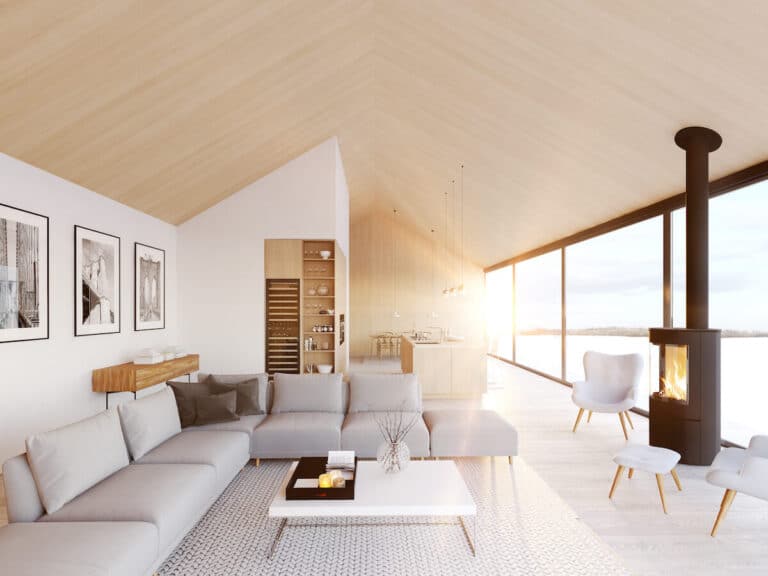
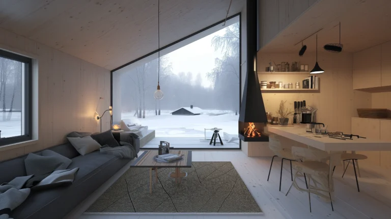
When the elements are in place, warm neutral walls, pale wood furniture, layered light, natural textures, a few well-chosen plants, the result should feel specific but not fussy. The compliment this style earns when it works: the room looks like someone has always lived there. Not just-decorated. Settled. If you want to see the same approach at a larger scale, the Scandinavian cabin interior post shows the aesthetic with exposed beams and more raw materials while keeping the same logic.
The Editing Test I Use Before Calling a Room Done
Before you stop adding things, try this: walk out of the room, wait ten minutes, then walk back in and notice the first thing your eye lands on. If it is a single element pulling focus, a bright throw pillow, a cluster of objects that is slightly too dense, that is your editing point. In a rustic Scandinavian living room, nothing should compete for attention. The whole room should feel like one coherent thing rather than a collection of individual decisions. When you walk in and your eye moves smoothly across the room without stopping anywhere in particular, you are done.
If you found this guide on rustic Scandinavian living rooms useful, follow us on Pinterest for more interior design ideas.
Frequently Asked Questions
What is rustic Scandinavian living room style?
A blend of Scandinavian minimalism with rustic warmth: clean lines and neutral palette from the Scandi side, rough wood, natural textiles, and imperfect surfaces from the rustic side. The Danish concept of hygge sits at the center, meaning the space is built for how it feels to be in, not just how it looks.
What colors work best for a rustic Scandinavian living room?
Warm whites with a yellow or pink undertone (Benjamin Moore White Dove or Sherwin-Williams Alabaster), medium wood tones, and one dark grounding element in charcoal or matte black. A working ratio: 70 percent pale neutrals, 20 percent wood, 10 percent dark accents.
How is rustic Scandinavian different from regular Scandinavian design?
Regular Scandinavian values refinement: smooth finishes, lacquered surfaces, precise detail. The rustic version values visible grain, imperfect surfaces, and raw materials. In a living room, that means worn linen over clean polyester and oiled oak over lacquered pine.
What type of sofa works best in a rustic Scandinavian living room?
Low-profile sofas (seat height 15 to 17 inches) in linen or cotton blends in oatmeal, cream, or warm gray. IKEA’s EKTORP and KIVIK work well when slipcovered in natural fabric. Avoid dark leather and high-gloss finishes.
Is a rustic Scandinavian living room expensive to create?
Not necessarily. Repainting walls in a warm off-white and slipcovering a sofa in natural fabric are the two cheapest and highest-impact changes. The pieces most worth spending more on are the coffee table and the rug.