10 White and Gold Interior Design Ideas That Actually Work

The first time I tried white and gold in my Austin apartment, I went too far. Gold hardware on every cabinet, four metallic throw pillows on the sofa, a large gilt mirror that made the room feel like a hotel lobby. I pulled most of it back before the week was over. After that, I spent a couple of months figuring out what actually stays. These ten ideas are the ones that made the cut.
White and gold interior design works because gold does one thing really well: it catches light. A single gold floor lamp in a white room changes the warmth of the entire space after dark. But that’s the key — gold has to earn its place. Used sparingly against white, it adds warmth and a little polish. Used everywhere, it turns into visual noise. Here’s what I’ve found works, from someone who learned it the hard way.

1. Mix Different Shades of White for Depth, Then Add Gold Accents

Pure bright white on every surface looks sharp in photos and cold in real life. The fix is simple: use a warm cream or eggshell for your soft furnishings while keeping the walls a cooler white. In my living room, I have Benjamin Moore Chantilly Lace on the walls and cream linen curtains. The contrast is subtle enough that you can’t point to it, but the room feels layered instead of flat.
Gold comes in after you have the white foundation. Start with one or two small accents — cabinet hardware, a picture frame, the base of a lamp. The tonal variation in the whites actually makes gold stand out more, because your eye has something to compare it to. A single gold object on a bright-white shelf almost disappears. The same object against cream cushions on a white sofa suddenly has context and weight.
For paint, test before committing. Cool whites look very different in north-facing light versus south-facing, and a $5 sample from Benjamin Moore is worth every cent. Pick your white based on the actual light your room gets, then let the gold follow from there.
2. Use Gold-Framed Mirrors to Add Depth and Move Light Around

I found a large gold-framed mirror at the Round Top flea market outside Austin for $40. Simple thin brass frame, about 30 inches across. I put it on the wall opposite my main window. After that, the room felt visibly brighter and it had nothing to do with adding light fixtures. The mirror was doing the work.
The sizing rule I use: a mirror should be roughly two-thirds the width of the furniture it sits above. A 90-inch sofa looks best with a mirror around 56-60 inches. Go smaller and the mirror reads as an afterthought. Go bigger and it starts competing with everything else. The sweet spot makes the mirror feel like it belongs to the wall rather than just hanging on it.
For current interior design thinking, simple gold frames are more flexible than ornate carved ones. A thin brushed brass frame works in modern rooms, transitional spaces, and rooms with more traditional furniture. Carved and gilded mirrors are period-specific and much harder to place without committing to a whole style.
3. White Flowers in Gold Vases: The Easy Way to Make a Room Look Finished

Fresh flowers are the fastest way to make a space feel lived-in and styled at the same time. In a white and gold room, white blooms in a gold vase almost arrange themselves visually. White ranunculus, grocery store tulips, or basic white carnations all look good. The vase carries the visual weight — the flowers just complete it.
If fresh flowers aren’t practical (I go through stretches where I forget to water anything), good faux options from H&M Home or a quality silk arrangement from HomeGoods hold up for months. What I’d skip: dried pampas grass. It doesn’t read as gold, it goes limp, and in a white room it introduces a dusty beige that works against the palette. Stick to structured white flowers or a simple leafy branch for the cleanest look.
For more on making flowers work in different rooms, the guide on using flowers in home decor covers the specific placement rules I follow. The short version: odd numbers of vases, and at least one tall arrangement to break up a flat surface.
4. Hang White Curtains High on Gold Rods to Make Ceilings Feel Taller

This is less about decoration and more about visual proportion. If you hang curtain rods right at the top of the window frame, the room looks exactly as tall as it is. Hang them four to six inches below the ceiling instead, and the room gains apparent height. It’s a straightforward trick, and the difference is larger than it sounds.
In my current apartment I couldn’t drill into the walls (rental rules), so I used tension rods as a temporary fix. They work, but you lose the ceiling-height effect. If you can put up real hardware, a brushed gold curtain rod from IKEA’s Hugad range runs $15-25 and looks solid without the price. For the curtain length: panels that skim or just touch the floor always read cleaner than ones that hover above it. Hovering looks like a measuring mistake.
5. Gold-Painted Trims: Less Is More Here

Most people who try gold trim end up doing too much of it. I’ve seen rooms where the crown molding, the baseboards, the window frames, and the door frames are all painted gold. The result isn’t luxurious — it’s chaotic. Gold trim works precisely because it’s selective.
My recommendation: pick one architectural element per room and do it well. Crown molding in a bedroom creates a polished, contained effect without competing with the furniture. Door frames in a hallway add warmth and visual punctuation as you move through the space. Both together in the same room gets competitive and loses the effect entirely. Gold draws the eye so effectively that you don’t need it on multiple surfaces to feel the impact.
For the paint finish: matte gold gives a quieter, more modern result. Metallic gold reads as more traditional and shows its shimmer at different times of day, which can be beautiful or distracting depending on your light situation. Test a small section and live with it for a full day before committing. Painter’s tape for clean edges is not optional here.
6. Gold Accents on White Bookshelves: The Negative Space Rule

When I first styled my home office shelves, my instinct was to fill every gap. Books, plants, frames, small sculptures — every shelf was packed. The gold pieces completely disappeared into the noise. Once I pulled out about a third of the objects and left actual empty space around the gold accents, everything looked intentional. The shelf went from cluttered to styled with one edit.
The rule I use now: for every gold accent on a shelf, leave at least one full section or half-section of empty space beside it. That negative space is what makes the gold read as a deliberate choice rather than clutter. For sourcing, Anthropologie’s sculptural objects are consistently good — well-finished, heavy, not too fussy. Ross Dress for Less is worth checking for discounted gold ceramics if you have the patience to browse. The best pieces often show up there for a quarter of what they’d cost elsewhere.
7. White Marble Coffee Table with Gold Legs: The Faux Version Works Fine

Real marble is cold, heavy, and prone to etching if you set an uncoastered wine glass on it. Faux marble — the engineered or printed kind — is lighter, more durable, and in the past few years the quality has gotten genuinely convincing. For a white and gold coffee table, the faux marble option in the $200-400 range from Wayfair or CB2 looks the part and holds up better in an everyday living room than the real thing would.
What matters more than the material is the size. A coffee table should leave 14-18 inches of clearance from the sofa edge. Too close and you’re constantly hitting your shins. Too far and it reads as a separate piece rather than part of the seating arrangement. I’d measure before buying every time — the right size in faux marble beats a perfect material in the wrong dimensions.
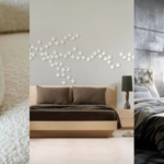
8. Gold Floor Lamp Next to a White Armchair: How I Set Up My Reading Corner

The corner of my living room has an IKEA Strandmon chair in a warm white boucle, a brass arc floor lamp, and a small side table. It’s the most-used spot in the apartment. The lamp does most of the work: it pools warm light over the chair in a way that overhead lighting never quite manages, and the brass finish ties into the other gold pieces in the room without needing to match them exactly.
One detail that makes more difference than most decor choices: bulb temperature. I use 2700K throughout the apartment. At 3000K or above, white walls start reading clinical. At 2700K the whole space feels warmer without going yellow. If you have strong natural light competition in the evenings, 2800K works. But stay below 3000K in an all-white interior — it’s the cheapest improvement you can make to the whole room.
9. White and Gold Abstract Paintings: Skip the Generic Prints

The generic version of this idea — a printed “abstract art” poster from a mass retailer — almost always looks flat. White and gold needs texture to work on canvas. What I’ve found looks genuinely good: original or small-edition pour paintings with gold leaf detail from Etsy. They run $80-250 for a medium canvas, and the texture is obvious from across the room in a way that a print can’t replicate.
Hang the painting so the center sits at eye level when standing — roughly 57-60 inches from floor to center. Above a sofa, aim for 6-8 inches of clearance between the sofa back and the bottom edge of the frame. Closer feels intentional. Twelve-plus inches creates an awkward gap that makes both the sofa and the art feel unmoored. If you’re unsure, tape a piece of paper the size of the artwork to the wall and live with the placement for a day before putting in the nail.
10. Gold Throw Pillows on a White Sofa: The Two-Pillow Limit

I’ll push back on what you see on most Pinterest boards here: four gold throw pillows on a white sofa is too many. Two is the number. One large solid gold velvet pillow and one smaller metallic or textured option gives you shine and contrast without the sofa looking like a display. Three works if one of them is neutral — cream or ivory — rather than gold. Four reads as someone trying very hard.
For fabric, velvet is the easiest to work with: it reads as more expensive than it is, holds its shape, and doesn’t shed. H&M Home carries good gold velvet options in the $20-30 range that feel and look solid. I’d skip cheap sequined versions, which catch lint and flatten after about six months. For the metallic effect without the wear, look for a boucle or jacquard with gold threading. It lasts longer and reads as more considered than a sequined surface.
Understanding the White and Gold Color Palette
White creates the sense of space and air that makes a room feel calm rather than busy. It gives the eye a place to rest, which is why all-white rooms photograph well — there’s no visual competition. The problem is that pure white without variation feels sterile rather than relaxing. The white shades section above addresses this, but it’s worth repeating: the temperature of your white (warm versus cool) determines how the gold reads in the same room.
Gold adds warmth and catches light in a way other metallic finishes don’t quite manage. Silver looks clinical against white. Copper can clash with warm whites. Gold sits in a specific range: warm without being orange, reflective without being flashy. That’s why this combination keeps returning in interior design across different eras — it’s a pairing that solves an actual problem rather than following a trend.
Color Psychology and Atmosphere
Rooms with a lot of white and just a little gold feel modern and inviting. The key is proportion. Gold picture frames, light fixtures, or table legs stand out well against white walls or furniture. A small amount of gold creates warmth; too much creates visual competition that undermines the calm quality of the white.
- Tips for using color:
- Use white for large areas (like walls or floors).
- Choose gold for details (knobs, frames, lighting).
- Keep gold accents small so the room does not look busy.
Balancing Warm and Cool Tones
White and gold look very different depending on the specific shades you choose. A bright, cool white makes rooms feel crisp and clean. Paired with a yellow-toned gold, it adds warmth without making things look dated. If your white has a warm undertone, it blends better with brass or a deeper antique gold.
| Gold Shade | Best White Pairing |
|---|---|
| Bright yellow gold | Cool, true white |
| Soft, pale gold | Warm or off-white |
| Rose or copper gold | Creamy or beige white |
The practical version of this: test your white paint with the actual gold hardware or finish you plan to use before making decisions. The relationship between the two shades matters more than either one in isolation, and you can’t judge it from a paint chip at the store.
Material Choices for White and Gold Interiors
The materials you choose affect how formal or casual the whole space reads. Marble and polished gold is formal. Matte linen and brushed brass is relaxed. Both are valid — but mixing them without intention produces spaces that feel inconsistent rather than layered. Match your finishes to each other, not just to the color story.
Popular Finishes and Textures
Mixing matte and glossy finishes creates a balanced atmosphere. Glossy white paint on walls reflects more light and makes rooms feel brighter. Matte gold handles and hardware keep things modern and resist fingerprints better than high-shine alternatives. For a touch of real texture, materials like marble or quality faux-marble on tabletops and backsplashes add depth that paint alone can’t provide.
| Material | Finish Type | Use |
|---|---|---|
| Marble | Polished/Matte | Countertops |
| Velvet | Soft/Fabric | Furniture |
| Metal | Brushed/Matte | Hardware, Decor |
| Glass | Glossy | Tables, Shelves |
Selecting Durable and Stylish Surfaces
White surfaces show dirt, which is the honest part of this color story. In a kitchen, white cabinets and countertops are beautiful and they need regular wiping. Semi-gloss or satin paint finishes clean much more easily than flat or matte — worth knowing before painting a whole room. For high-traffic areas, stain-resistant fabric on seating is a practical requirement, not a compromise.
For floors, large-format white porcelain tiles are scratch-resistant and show less dust than smaller tiles because there are fewer grout lines to track. Pale engineered wood pairs well with white and gold without competing. Both are solid options — the choice comes down to budget and maintenance preference. For spaces that draw on Art Deco design influences, which use white and gold extensively, a pale geometric tile can add a third layer of interest without disrupting the palette.
Frequently Asked Questions
How can I incorporate gold accents into my white living room?
Start with one or two functional pieces that already have gold as part of their design: a floor lamp with a brass base, cabinet hardware, or a gold-framed mirror opposite the main window. These serve a purpose and add gold without feeling decorative-only. Once you have those anchors, add one small accent on a shelf or coffee table. Three well-chosen gold pieces in a white living room is usually enough.
What are some white and gold interior design ideas for a modern bedroom?
Focus on the hardware first: gold drawer pulls on a white dresser or nightstand immediately changes how the room reads without major effort or cost. Add a brass or gold arc floor lamp beside the bed for warm reading light at 2700K. If you want soft furnishings, one gold velvet throw pillow on a white or cream duvet is the right amount. Keep curtain rods in brushed gold and hang the panels close to the ceiling for height.
Can you suggest some white and gold home office decorating tips for a chic look?
In a home office, gold accents work best when they’re functional: a brass desk lamp, gold pen holder, or gold-framed corkboard above the desk. Avoid purely decorative gold objects on a work surface — they collect clutter and distract. A white desk with a single brass lamp and gold hardware is cleaner and more effective than filling the space with matching gold accessories.
Craving more inspiration? Follow us on Pinterest for endless ideas or subscribe to our newsletter for the latest trends right in your inbox!