How to Style Italian Interior Design Like a Professional Designer

Italian interior design is one of those subjects where the cliché gets in the way of the actual principles. Most people hear “Italian design” and picture either a Roman villa with frescoed ceilings or a stark Milanese loft with one very expensive sofa. Neither is wrong, but both miss the underlying logic: Italian design treats a room as a conversation between craftsmanship, light, and human scale. I’ve spent years working with clients who wanted “an Italian feel” and the first thing I always ask is: which Italy? The answer shapes everything about the material palette, the furniture profile, and what the room is actually trying to do.
The range within Italian interior design is wider than most style categories. A Tuscan farmhouse and a Milan apartment have almost nothing in common visually, yet both fall within the category. What they share is a commitment to quality over quantity, a preference for materials that age well, and a deliberate avoidance of anything that looks purely decorative. Understanding those shared principles is more useful than chasing a mood board.
The Core Principles of Italian Interior Design
Color: Warm Undertones Over Cool Neutrals
The Italian color palette is often described as “warm neutrals,” which undersells how specific it actually is. The palette leans toward ochres, warm terracottas, faded reds, and the particular off-white you see on old plaster walls (not cool gray, not bright white). That warm undertone in the walls is what makes Italian rooms feel lit even when the windows are modest in size.
I worked through this on a project in a Chicago brownstone where the client wanted a Venetian atmosphere in a room with north-facing light. We went through four rounds of paint samples before landing on a warm cream with a strong yellow undertone. The difference from a cooler off-white was subtle in the pot and significant on the wall: the room stopped feeling like a magazine setup and started feeling lived-in. The key principle here is that Italian interiors are calibrated for how natural light hits warm stone, not how it hits painted drywall. You’re recreating the logic, not the material.

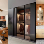
Materials That Earn Their Place
Italian design is fundamentally about material honesty. Marble isn’t decorative. It’s structural, or treated as if it were. Stone floors aren’t a luxury statement: they’re the practical choice that happens to look better after decades of use. Wood is used for what wood does: warmth, grain variation, the ability to be repaired rather than replaced. Each material has a job, and the quality of how it does that job is the design statement.
In practice, this means: if you’re building out an Italian-influenced room, avoid imitations. A porcelain tile that looks like marble is not an Italian choice. If you can’t afford marble, use well-finished concrete or quality limestone instead. This is where most budget attempts at Italian style fall apart: the material hierarchy is immediately visible, and synthetic substitutes expose themselves as cost-cutting rather than design judgment. For furniture in the mid-range, Calligaris holds to construction standards that show in the details. If you’re specifying case goods and storage at a higher level, Poliform is the benchmark. Their edge banding and internal joinery is a consistent reference for what Made in Italy actually means in manufacturing terms.

Space Planning: Less Furniture, More Architecture
Italian rooms are almost never over-furnished. This surprises people who associate Italian design with opulence, but the opulence is in the quality of individual pieces, not in how many of them occupy a room. Space planning in Italian interiors keeps traffic lanes clear and lets the architecture itself be visible. A well-proportioned room doesn’t need to be filled to justify its dimensions.
Lighting follows a layered logic: a central fixture that establishes scale, plus task and accent sources that operate independently. The goal isn’t to light the room evenly: it’s to light specific moments and let the rest recede. I’ve used this on ranch-style projects in Montana where the architecture was horizontal rather than vertical. It works regardless of ceiling height because it creates depth, not just volume. Natural light is maximized through furniture placement that keeps window access clear.

The Two Main Faces of Italian Style
Modern Italian: Milan’s Restrained Sophistication
Modern Italian design as it developed out of Milan is disciplined in a way that gets confused with Scandinavian minimalism. The difference is in the warmth of the palette and the presence of handcraft. A Milanese living room is minimal, but the sofa fabric is usually velvet or high-grade linen. There’s no austerity for its own sake. The materials are quietly considered and the restraint is intentional, not accidental.
Contrary to what a lot of trend content suggests, good modern Italian design is not afraid of one piece from another era. Studio Marcante-Testa brings in an antique table or hand-blown glass piece alongside contemporary work. That counterpoint stops a room from looking like a hotel lobby. The mix of periods is not eclectic decoration: it’s a statement that the room has existed through time. For how this plays out in a neighboring Mediterranean tradition, my guide on Spanish interior design covers those parallels directly.

Tuscan Style: Rural Warmth and Textural Depth
Tuscan style is the other pole: exposed wooden beams, terracotta floor tiles, stone walls, wrought iron hardware. It’s warmer and more textured than the Milanese approach, and it suits certain building types better. In my experience, it translates particularly well in homes with existing natural stone or heavy timber structures. Trying to create a Tuscan feel in a 1970s ranch with flat ceilings and minimal natural materials requires too many interventions to make the result convincing.
The elements that travel most reliably out of their regional context: handmade ceramics with visible glaze variation, natural linen in earthy tones, and furniture that shows its construction (visible joinery, turned legs, patinated iron). The character of Tuscan interiors comes from evidence of age and use, not from a style kit applied to new construction. If you’re starting with a newer home, focus on the furniture and textile layer. The European interior design guide has useful framing for how regional European styles intersect and diverge.

Designers Who Defined Italian Interiors
Studio Peregalli: History as a Living Reference
Studio Peregalli, founded by Laura Sartori Rimini and Roberto Peregalli, specializes in interiors where historical elements are treated as equal partners to contemporary furnishings. Their projects feel genuinely old in the best sense: the historical references are specific (a particular Roman furniture period, a decorative tradition from Northern Italy) rather than generically vintage. I’ve used their published work as reference material with clients who want depth and layering, because it demonstrates how to apply historical specificity without overwhelming a contemporary space.

Piero Lissoni: Proportion Before Everything Else
Piero Lissoni’s work, particularly his long collaborations with Porro and Boffi, is a study in how restraint functions at a practical level. His furniture avoids decoration but isn’t cold: the warmth comes from material choice and proportion. If you’re sourcing Italian-influenced furniture without the budget for bespoke, the Lissoni reference is useful as a purchasing framework: proportional correctness first, material quality second, surface detail last. Most furniture failures I see in Italian-influenced interiors come from reversing that order.

Dimore Studio: Bold Color in a Disciplined Frame
Dimore Studio, founded by Emiliano Salci and Britt Moran, is where Milan’s design personality gets most explicit. Bold color against restrained form, vintage pieces in contemporary settings, a willingness to make the room feel theatrical without losing residential functionality. One principle from their work travels reliably to any budget level: one strong color moment per room. It’s a more honest solution than neutral walls throughout and then wondering why the space feels flat.

Cristina Celestino: Traditional Craft, Contemporary Application
Cristina Celestino is worth following for how she handles traditional Italian craft materials, particularly terrazzo and colored glass. Her work demonstrates that techniques standard in Italian craft for generations can be applied in completely contemporary contexts without nostalgia. What struck me the first time I came across her installation work: the traditional craft knowledge made the contemporary design more substantial, not more decorated. Craft techniques add material depth; applied decoration adds surface interest. These produce different rooms.

Italian Brands Worth Knowing
The “Made in Italy” Standard: What It Actually Means
The Made in Italy designation is legally protected: it requires production in Italy at every stage, not just final assembly or design. Brands like Esperiri Milano operate at the high end of this standard, with fully specified interiors using Italian-produced materials with traceable provenance. For most residential projects that level of specification isn’t practical, but it sets the benchmark you’re working against. For accessible entry: Calligaris for upholstered pieces and dining furniture, Artemide for interior lighting, and Bisazza for tile work if you want the authentic mosaic tradition.

Foscarini: Lighting as a Design Statement
Foscarini makes the case that lighting design is a discipline in its own right, not a finishing task. Their fixtures share a consistent philosophy: unconventional materials (resin, fiberglass, fabric) used to create objects that define space rather than just illuminate it. The Aplomb fixture, a cone of raw concrete hanging from a thin cord, works in both very contemporary and more traditional settings because the material reference is architectural rather than decorative. I specify it in projects where I need a statement piece that doesn’t read as trying to be one. The Buds series handles the same logic in a less literal material.
The broader point: in Italian interiors, lighting fixtures receive the same specification weight as furniture. A poorly chosen pendant undermines a well-specified room. If the rest of the principles are in place and the room still isn’t working, the lighting is usually where I look first.

Applying Italian Design Principles at Home
The Italian design approach translates across budgets if you’re clear on priorities. Start with the color temperature of your walls: warm undertone, not cool. Then address the floor: if existing flooring resists the direction you’re taking, area rugs in natural materials (jute, wool) are a practical interim layer. Introduce one genuinely well-made piece per room rather than filling the space with average-quality objects. A lamp from a credible Italian brand, a ceramic piece from an artisan producer, or a piece of furniture where you can see and feel the construction each changes how the room reads.
Resist the impulse to source everything from a single collection. Italian interiors accumulate over time: different periods, different producers, pieces that were bought for function and turned out to be well-made. That accumulation is what gives them character. Rooms designed all at once from the same catalog look finished in the wrong way. If the historical dimension interests you, the Baroque interior design guide covers the most historically specific end of the Italian tradition.
Frequently Asked Questions
What are the defining characteristics of Italian interior design?
Italian interior design is defined by material quality, warm color palettes, and a balance between craftsmanship and restraint. It favors pieces that age well over purely decorative items, and treats lighting and space planning as core design decisions rather than afterthoughts.
How is Modern Italian design different from Tuscan style?
Modern Italian design, centered on Milan, is clean-lined and disciplined with a warm material palette. Tuscan style is more textural and rural: terracotta floors, exposed timber, wrought iron, and handmade ceramics. The two share a commitment to material quality but express it through different visual vocabularies.
What does the Made in Italy designation actually guarantee?
Made in Italy is a legally protected designation requiring production at every stage to occur in Italy, not just final assembly or design. It is a meaningful standard in furniture and lighting, but you need to verify it specifically. Some brands use Italian-sounding names without the manufacturing to back it up.
Can I achieve an Italian-influenced interior without a large budget?
Yes, but prioritize correctly: wall color temperature first, then one well-made piece per room, then material authenticity in whatever you can afford. Avoid synthetic imitations of natural materials. Mid-range Italian brands like Calligaris and Artemide hold to standards worth the price difference over comparable-looking budget alternatives.
Which Italian designers are most useful as design references?
Studio Peregalli for historically layered interiors, Piero Lissoni for proportion and restraint, Dimore Studio for bold color within a disciplined frame, and Cristina Celestino for how traditional Italian craft techniques translate into contemporary work. Each demonstrates a specific principle clearly enough to use as a reference rather than just inspiration.