Old Money Interior Design: Restraint as a Material Choice

Old money interior design is not a prop room with hunting prints and fake crests. It is restraint shown through material choice: wool that lasts, wood with quiet grain, stone or marble where touch matters, and furniture silhouettes that ignore trend cycles.
I grew up nowhere near generational wealth, but I learned old money cues from vintage furniture markets: buy less, buy solid, keep surfaces calm, let one antique carry history instead of ten reproduction novelties.
The pins show quiet rooms. This article is the decision filter: which upgrades earn permanence, how to mix inherited and new without mismatch chaos, and why visible logos fail the test.
Old money interior design is a filter question: will this piece still feel right in ten years, and can I maintain it without a storage unit of replacements.
Restraint Beats Display
Old money interior design hides wealth in weave and joinery, not shelf talkers. I skip branded decor and logo throw pillows entirely.
Fewer objects, better objects. One good oil painting beats a gallery wall of prints that date in five years.
Closed storage for daily clutter is non-negotiable. Sideboards and armoires keep surfaces empty at night.
Mirrors are functional and framed simply, not gilt overload unless architecture already supports ornate.
When I apply Restraint Beats Display in my Austin rental, old money interior design should feel easier to maintain, not harder to explain. I test the change for a full week of normal routines, not a weekend photo session. If bags, mail, or dishes break the calm, the layout still needs editing before I shop again.
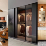
Materials That Age With Dignity
Wool rugs, linen drapes, solid wood case goods, leather with patina, brass with living finish. Old money interior design invests where hands touch daily.
Particleboard with veneer chip is the opposite of the ethic. I save longer for one solid piece.
Stone tops on tables survive red wine and decades. Laminate pretends until the edge swells.
Avoid trendy plastic finishes pretending to be lacquer. They scratch and look tired fast.
When I apply Materials That Age With Dignity in my Austin rental, old money interior design should feel easier to maintain, not harder to explain. I photograph the room at the same hour for three days so shifting light does not trick me into false confidence about materials or scale.
Color: Navy, Cream, Forest, and Brass
Palette stays subdued and classical: navy, cream, forest green, warm gray, occasional burgundy. Old money interior design does not chase neon accent years.
White should be warm, not hospital. I sample creams with yellow or gray undertone based on light.
Patterns stay classic: stripe, houndstooth, toile in small doses. One patterned chair, solids elsewhere.
Metals stay brass or nickel with consistency, not mixed flash.
When I apply Color: Navy, Cream, Forest, and Brass in my Austin rental, old money interior design should feel easier to maintain, not harder to explain. I walk the path with laundry, groceries, or work gear because old money interior design has to survive real life, not an empty showroom walkthrough.
Inherited Pieces and New Purchases
Mix eras by matching undertone and scale, not exact match sets. Old money interior design looks collected, not delivered yesterday as a suite.
Reupholster heirloom frames in solid linen instead of loud print. Shape stays, noise drops.
When inherited wood is dark and room is small, lighten walls and rug rather than rejecting good bones.
Document maker marks and care for wood properly. Maintenance is part of the look.
When I apply Inherited Pieces and New Purchases in my Austin rental, old money interior design should feel easier to maintain, not harder to explain. I ask one honest friend to sit for ten minutes and name the first object they notice. If it is not the focal point I planned, I edit before spending more.
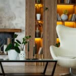
Art and Books as Quiet Signal
Art does not need gold frame everywhere. Simple frames, good matting, proper hanging height at eye center.
Books grouped with breathing room read collected, not hoarded. Old money interior design edits spines like wardrobe.
Family photos in quality frames, limited count on public walls. Gallery of snapshots reads anxious.
One sculptural object on console, not a flea market shelf. Negative space is confidence.
When I apply Art and Books as Quiet Signal in my Austin rental, old money interior design should feel easier to maintain, not harder to explain. I keep a short notes list on my phone: what worked, what annoyed me, what I would repeat. That list beats impulse buys when the room drifts.
Rental Paths to Quiet Luxury
Upgrade lighting and drapery first; they change perception without landlord fights.
Thrift solid wood with dovetail signs, refinish if needed. Old money interior design loves honest age.
Performance wool or blend rugs give look without fragile silk anxiety.
Compare adjacent ideas in interior design styles so quiet classic does not slide into hotel generic beige.
When I apply Rental Paths to Quiet Luxury in my Austin rental, old money interior design should feel easier to maintain, not harder to explain. I test the change for a full week of normal routines, not a weekend photo session. If bags, mail, or dishes break the calm, the layout still needs editing before I shop again.
Tabletop and Dining Restraint
Old money interior design uses real silver or quality flatware quietly, not display racks on walls.
Table linens pressed lightly, not stiff formal unless you enjoy ironing daily.
Centerpiece low enough for conversation sightlines: bowl, candles, or branch, not tower.
Chairs with solid joinery outlast trend silhouettes. Buy once, reupholster later.
When I apply Tabletop and Dining Restraint in my Austin rental, old money interior design should feel easier to maintain, not harder to explain. I photograph the room at the same hour for three days so shifting light does not trick me into false confidence about materials or scale.
Library and Study Corners
Books grouped with breathing room read collected, not hoarded. Desk lamp brass or green glass classic shapes beat novelty LED gadgets.
Leather desk pad ages well and protects wood without plastic mat shine.
Wire basket for daily papers prevents desk romance becoming paper avalanche.
Closed cabinet for printer and supplies keeps study calm on video calls.
When I apply Library and Study Corners in my Austin rental, old money interior design should feel easier to maintain, not harder to explain. I walk the path with laundry, groceries, or work gear because old money interior design has to survive real life, not an empty showroom walkthrough.
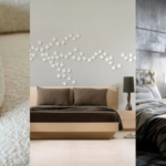
Guest Room Understated Hospitality
Guest rooms need quality mattress and linens, not theme baskets. Hospitality is sleep, not props.
Empty drawer and closet rod space signals welcome better than decorative pillows alone.
Neutral palette lets guests mentally unpack without color fight.
One good reading lamp and blackout shade beat basket of sample toiletries.
When I apply Guest Room Understated Hospitality in my Austin rental, old money interior design should feel easier to maintain, not harder to explain. I ask one honest friend to sit for ten minutes and name the first object they notice. If it is not the focal point I planned, I edit before spending more.
Teaching Kids Quiet Taste Early
Kids rooms can have quality wood bed and washable rug without cartoon explosion. Old money interior design is habit formation.
Toy storage closed with labeled bins teaches edit cycles.
Art from child framed simply on rotation wall, not every surface covered.
Start with design basics when calm structure matters more than new decor.
When I apply Teaching Kids Quiet Taste Early in my Austin rental, old money interior design should feel easier to maintain, not harder to explain. I keep a short notes list on my phone: what worked, what annoyed me, what I would repeat. That list beats impulse buys when the room drifts.
Old money interior design is calm materials, edited objects, and quality you can feel. Skip crest props, buy solid once, and let rooms whisper instead of shout. See home decor when you want adjacent ideas.
Touch your sofa arm, rug edge, and curtain panel. If nothing feels substantial, upgrade one touch point before another decor run.
Old money interior design is quiet on purpose. If a guest can name every brand in the room, you are still decorating loud, not living calm.
Buy the best touch point you can afford once, then stop shopping until it wears honestly.
FAQ
Is old money just traditional?
Related but quieter. Less ornament, more material honesty and editing. The goal is calm function, not period costume.
Can renters participate?
Yes via textiles, lighting, thrifted solid wood, and strict clutter control.
What screams fake?
Logo pillows, mass crest art, shiny faux gold, and too many theme props.
Best first splurge?
Wool rug or solid wood console with simple lines.
How many patterns?
One classic pattern maximum per room unless architecture is already ornate. More than that reads trend-chasing, not old money restraint.