Baroque Interior Design: What Actually Works (And What Doesnt)
 1")
Baroque interior design is the style most people admire in photographs and then immediately decide is too much for a real home. I’ve had that exact reaction, and I’ve also been wrong about it. After working on a gut renovation for a client in Lincoln Park who specifically wanted a Baroque-influenced formal dining room, I came out with a different understanding: the problem usually isn’t the style itself. It’s that people try to apply the visual surface of Baroque without understanding the structural logic underneath it.
The key principle here is that Baroque isn’t about adding more. It’s about controlling intensity. Every element in a genuine Baroque interior is in conversation with everything else, and when that conversation breaks down, it tips into chaos. Worth understanding before you commit to a single gilded mirror.
The Visual Language of Baroque
Scale and Architecture That Commands Attention
The first thing that strikes you about authentic Baroque interiors is the ceiling. Not the furniture, not the art: the ceiling. Baroque architecture built up before it spread out, using vaulted cupolas, coffered ceilings, and stucco relief work to establish verticality as the organizing principle of a room. In practice, this means Baroque works best in spaces that have the height to sustain it. I’ve seen attempts to recreate the look in rooms with 8-foot ceilings, and without that vertical space, the ornament has nowhere to breathe. It crowds the walls and reads as busy rather than grand.
The colonnades, doorway frames, and arch treatments are where the style makes its first argument. Baroque architects knew that the frame matters as much as the content, which is why doorways in period interiors are often as detailed as the rooms they open into. If you’re working with an existing structure, the most direct way to signal the style is through architectural trim: deep crown molding, ceiling medallions, and framed archways. These don’t require palace scale. They require a commitment to treating the architectural shell as part of the design, not just a neutral backdrop.
 2")
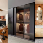
Furniture Built for Presence, Not Comfort
Baroque furniture is not subtle, and it’s not supposed to be comfortable in the modern sense either. The pieces are scaled for visual authority. Chairs are high-backed and architecturally structured; sofas, when they appear in period interpretations, are upholstered in silk damask or velvet with carved wooden frames that show more craftsmanship than the fabric sitting on top of them. The gilded accents on tables, cabinet legs, and headboards aren’t decorative additions. They’re the point.
When I was sourcing pieces for the Lincoln Park dining room, I spent more time on the chairs than anything else. We ended up with a set of Italian-influenced carved walnut chairs upholstered in a deep bronze velvet from Kravet. They’re not comfortable for a three-hour dinner, but they hold the room together visually in a way that no modern chair could have. That’s the Baroque trade-off, and it’s worth being honest about before you buy.
 3")
The Color Logic Behind the Drama
Most people hear “Baroque color palette” and picture gold. That’s part of it, but the actual logic is contrast. Baroque interiors work in deep, saturated anchor colors: maroon, midnight blue, forest green, burgundy. Gold and silver function as the secondary layer that gives those colors their charge. The contrast between a deep emerald wall and a gilded plaster cornice is what generates the visual drama, not the gold on its own.
What most contemporary Baroque-inspired rooms get wrong is using gold as a base instead of an accent. A room that’s predominantly gold comes across as Las Vegas, not Versailles. The key principle here is that the dark anchors the gold, not the other way around. Start with the wall color: pick something with genuine depth, then layer the gilded elements on top. The color does the heavy lifting. The gold responds to it.
 4")
Light, Art, and Surface
Chandeliers and Mirrors: Lighting as Spatial Tool
Baroque lighting is not ambient lighting. It’s theatrical lighting. The crystal chandelier isn’t just a light source: it’s a suspended sculpture that casts the room in a specific quality of light, with refraction as an intentional effect. The wall sconces flanking a fireplace or doorway aren’t supplemental. They’re part of the architectural symmetry, and removing one breaks the visual logic of the whole arrangement.
The mirror has a technical function in Baroque interiors that’s worth understanding: it multiplies light and extends perceived space while providing a frame for more ornamental work. The Hall of Mirrors at Versailles is an extreme version of a principle that operates at any scale. Use mirrors to work with your light sources, not just as isolated decorative objects. For a residential application, I’d look at Venetian-style mirrors with gilded frames. Uttermost makes solid versions in the $400-800 range that bring the right visual weight without the cost of a genuine antique piece.
 5")
Paintings and Frescoes: When Walls Work Harder Than Furniture
In authentic Baroque interiors, the artwork isn’t hung on the wall. It grows out of the wall. Ceiling frescoes, painted panels, and trompe-l’oeil murals treat the architectural surface as a continuation of the interior narrative. The technique of chiaroscuro (high contrast between light and shadow) was as much a design tool as a painterly technique, giving flat surfaces the illusion of depth and movement. Caravaggio and Artemisia Gentileschi used it to create emotional tension in religious scenes. The same visual energy applies in a room: artwork that plays strong darks against lights activates a space differently than something flat and even-toned.
I’ve seen a single large-scale reproduction print of a Baroque masterwork do more for a dining room than six pieces of contemporary art combined. Not because the reproduction is better, but because the visual composition of the original Baroque painting was built for exactly this kind of room. It’s one of those design observations that sounds obvious once you see it in practice and isn’t obvious at all before that.
 6")
Sculptural Detail as Structural Argument
Gian Lorenzo Bernini understood that sculpture in an interior isn’t decoration. It’s argumentation. His figures twist, reach, and strain in ways that introduce movement into what would otherwise be a static space. The marble is carved so fine it looks like cloth or skin rather than stone. That quality of material pushed to its technical limit is a defining characteristic of Baroque craft, and it’s why lesser reproductions always fall flat: you can see where the commitment stopped.
For residential interiors, full-scale sculptural pieces are rarely practical. But the principle extends to smaller applications: carved wooden brackets, stucco relief panels, and high-quality plaster busts can introduce the same three-dimensional presence that defines the style. Contrary to what most design guides suggest, you don’t need to be cautious with sculptural elements in a Baroque room. Timidity here produces a worse result than commitment. A single substantial carved piece does more than three modest ones placed carefully around the room.
 7")
Textiles That Justify the Craftsmanship
Tapestries, silk, velvet, and brocade are the surface materials of Baroque interiors, and they’re not interchangeable with their cheaper modern equivalents. The weight, texture, and drape of genuine velvet behaves differently from polyester velvet on furniture and on windows, and in a style where material quality is part of the design argument, that difference shows immediately to anyone paying attention.
The one area where contemporary Baroque interpretations consistently underperform is drapery. Period interiors used floor-to-ceiling treatments with proper lining, pooling fabric, and heavy tiebacks. Modern versions often use curtain panels that are too narrow, too short, and too light. If you’re committing to one textile element, spend it on the drapery. It changes the vertical dimension of a room more than any other single material choice. For fabric, Schumacher’s Baroque-period reproduction lines, particularly their heavier brocades and damasks, are the right weight for the style and worth the investment over a budget alternative.
 8")
Three Baroque Traditions Worth Understanding
Italian Baroque: Grand Scale, Religious Energy
The Italian Baroque emerged in the 1600s as a direct response to the Protestant Reformation. The Catholic Church needed a visual language powerful enough to counter Protestant austerity, and it found one in the work of Bernini, Borromini, and Pietro da Cortona. Italian Baroque interiors are characterized by complex curvilinear forms, domed spaces, and an aggressive sense of upward movement: everything pulls the eye toward the ceiling and, by implication, toward the divine. This is the version most closely tied to the broader European interior design tradition it emerged from, and the version that demands the most from the architecture it inhabits.
In practice, Italian Baroque is the most architecturally demanding version of the style. It requires high ceilings, substantial walls, and enough square footage to let the scale work without overwhelming the occupant. It’s the version that translates worst to residential settings without significant architectural intervention, which is also why it’s the most impressive when it actually succeeds.
 9")
French Baroque: Symmetry as Power Statement
The Palace of Versailles is the most documented example of French Baroque, and the principle it operates on is different from the Italian original. French Baroque under Louis XIV was about political theater: every room in Versailles was designed to communicate the power and order of the monarchy. Symmetry is rigorous. Color is controlled. The trompe-l’oeil techniques and mirrored surfaces were tools for making the king’s authority appear boundless. If you want to see how that approach connects to a more residential tradition, Parisian interior design draws on many of these same principles at a more livable scale.
For contemporary interiors, French Baroque is more transferable than the Italian. The symmetry principle applies at any scale: paired sconces, mirrored alcoves, repeating pattern in wallcovering or molding. You don’t need the scale of Versailles to access the underlying logic, which is that deliberate order in a heavily decorated room communicates authority rather than chaos.
 10")
Modern Baroque: What the Contemporary Versions Get Right
Modern Baroque is where things get interesting, and also where they most often go wrong. The versions that work understand which Baroque principles to keep (contrast, scale, and material quality) and which to leave in the 17th century. The versions that don’t work treat Baroque as a collection of visual symbols: gold, chandeliers, velvet, and heavy molding applied to a space that has no underlying structural logic. The result looks more like a hotel lobby that’s trying too hard than a considered interior.
Modern Baroque has interesting overlaps with other ornate European traditions. The dramatic instincts of Victorian Gothic interior design draw on some of the same impulses toward darkness and richness, though through a completely different historical and cultural lens. Understanding where Baroque ends and adjacent styles begin is part of what makes the modern application coherent rather than confused.
 11")
Making Baroque Work in a Real Home
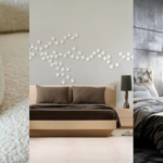
The Single-Room Strategy That Holds Up
The first time I worked with Baroque elements on a client project, the brief was a bedroom. I assumed we’d be pulling in a few gilded details and calling it done. What the client actually wanted was a bedroom that felt, in her words, “like it had a past.” We ended up with dark walnut paneling on two walls, a Venetian mirror, a four-poster bed with carved posts, and heavy linen velvet drapery that pooled on the floor by about two inches. No art above the headboard, because the wall itself was doing enough work.
The room holds together because we treated it as a whole system, not as a collection of Baroque pieces added to a neutral space. What Baroque needs more than anything is internal coherence. Each element has to be in deliberate conversation with the others. Add a gilded mirror to a room full of Scandinavian minimalism and you get conflict. Add it to a room where the color, scale, and material are already aligned and you get something that feels intentional. That alignment is the actual work, and it doesn’t happen by accident. The best contemporary Baroque rooms, like strong applications of Art Nouveau interior design, share a commitment to a coherent decorative system rather than a collection of stylistic gestures. That’s where Baroque’s durability as a style comes from.
 12")
Frequently Asked Questions
What defines baroque interior design?
Baroque interior design is defined by grand scale, dramatic contrast, ornate surface detail, and material opulence. The style originated in 17th-century Europe and uses deep anchor colors, gilded accents, elaborate carved furniture, and theatrical lighting to create spaces with deliberate emotional weight.
Can baroque interior design work in a modern home?
Yes, but it requires choosing one room and committing to it fully. The single-room approach works better than spreading Baroque elements throughout a home. A formal dining room, library, or bedroom done in a genuine Baroque register is more effective than a diluted version across multiple spaces.
What colors are used in baroque interior design?
Deep, saturated anchor colors are the base: maroon, midnight blue, forest green, and burgundy. Gold and silver function as secondary accents, not the primary palette. The contrast between dark wall colors and gilded elements produces the visual drama characteristic of the style.
What is the difference between Italian and French baroque interior design?
Italian Baroque emphasizes complex curvilinear forms, domed spaces, and upward visual movement, driven by religious commissions. French Baroque under Louis XIV prioritized rigorous symmetry and controlled opulence as expressions of political authority. French Baroque is generally more transferable to residential settings.
What furniture materials are typical in baroque interior design?
Baroque furniture uses walnut, oak, and other hardwoods with carved decorative detail, often finished with gilded or lacquered accents. Upholstery fabrics include silk damask, velvet, and brocade. Material quality is central to the style; synthetic substitutes undermine the visual argument the style depends on.
If you found this guide useful, follow us on Pinterest so you don’t miss any more interior design content.