How to Style Spanish Interior Design Like a Professional Designer

The first time I worked on a Spanish-style residential project, I expected it to feel heavy. That’s what most people assume when they see the photos: thick walls, rough textures, dark wood, lots of iron. But when I stood in the actual space, what struck me was how light it felt. That’s the real secret of Spanish interior design, and it’s one that almost no online guide explains correctly.
Spanish interiors work because they’re built around contrast. Rough against smooth. Warm against cool. Dense material against open space. The roughness of the stucco isn’t oppressive because the window lets in direct sunlight. The wrought iron looks ornate but it’s not heavy because it’s set against a white wall. Understanding these pairings is the key to getting this style right, and it’s where most DIY attempts fall apart.
I’ve designed and styled a handful of spaces with genuine Spanish influence: from a Chicago apartment where we used a single terracotta tile backsplash to anchor the kitchen, to a full hacienda-style living room overhaul for a client who had spent years in Tucson and wanted that feeling back. This guide pulls from those projects. It’s the actual reasoning behind why Spanish interior design looks and feels the way it does.
The Architecture That Makes Spanish Interiors Unmistakable
Spanish design didn’t develop in isolation. It absorbed Moorish influence through centuries of coexistence in Andalusia, Roman structural logic, and the craftsmanship traditions of indigenous artisans. What emerged was a vernacular architecture adapted for Mediterranean heat: thick walls that stay cool, small windows that block midday sun, interior courtyards that allow air movement. Every decorative element you see in a Spanish interior has a functional root. That history is worth understanding before you start making material choices.
Stucco Walls and Why the Texture Actually Matters
Most people treat stucco as a surface option: you either have it or you don’t. But the texture of traditional stucco isn’t just aesthetic. It creates depth under light. When sunlight hits a smooth painted wall, it bounces flat. When it hits hand-applied stucco, it moves across the irregularities and creates something that looks almost alive. That visual movement is what gives Spanish rooms their warmth even when the palette is mostly white.
For a client project in Oak Park, I used a lime-based plaster in a warm white to approximate this on an otherwise standard drywall construction. We applied it with a wide palette knife in a skip-trowel pattern. It wasn’t the same as genuine adobe, but it read correctly in the space. The key was finishing with a slightly rough texture, not the smooth plaster you’d use in a contemporary home. The visual effect was the single biggest contributor to the room feeling authentically Spanish.

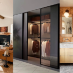
Arched Doorways: Not Decorative Additions but Structural Logic
The arch is everywhere in Spanish architecture, and it’s one of the features people most want to replicate. The Moorish influence brought the horseshoe arch; the Romans contributed the round arch. In genuine Spanish homes, these aren’t added for decoration: they’re structural. When you add an arch to a modern home, you’re putting a decorative element into a structural context it wasn’t designed for. That can work, but requires understanding the difference between honest application and pastiche.
If you’re working in a renovation context, the most effective approach is to add arched openings in non-load-bearing positions. A half-wall with an arched top between a living room and dining room reads as Spanish without being structurally misleading. I’ve seen this work consistently well in modern apartments. Full arched windows require proper framing and are better left to new construction projects with a structural engineer involved from the start.

Spanish Interior Design and the Art of the Color Palette
Spanish color is often described as earthy, which is accurate but not specific enough to be useful. The real palette layers warm neutrals against saturated accents, but the accents are never primary colors. You’re looking at terracotta, ochre, deep indigo, the blue-green of Moorish tiles, and the particular dusty orange that Spanish sun-baked pigments produce. It’s warm, but the warmth isn’t aggressive. That distinction is what separates a well-executed Spanish room from one that looks like a Southwestern gift shop.
The Terracotta Question: How Much Is Too Much
Terracotta is the element people overuse when trying to achieve Spanish style. A floor entirely in terracotta tiles reads as Spanish, but it also reads as uniform, and uniform spaces feel flat. The way terracotta actually functions in authentic Spanish rooms is as an anchor at the floor level, against which everything above it is lighter and often cooler.
My rule, developed after seeing this go wrong more than once: if you’re using terracotta floor tiles, your walls should be white or very pale. If you want terracotta on the walls as a painted accent, keep your floors lighter. The terracotta gets its warmth from the contrast with something cooler and paler next to it. Remove that contrast and the terracotta reads as muddy rather than warm.

White Stucco as the Neutral That Actually Works
White stucco is the backbone of Spanish interior design’s color system, and most people underestimate how much variety exists within the word white. Spanish whites lean warm. They’re not the cool blue-white of Scandinavian minimalism. They carry yellow or pink undertones that make them feel sun-washed rather than sterile. Put a cool white next to terracotta tile and the terracotta looks like dried dirt. Put a warm white next to the same tile and the terracotta glows.
When I source paint for Spanish-style projects, I look for whites with a warm undertone in the 2 to 4 percent yellow or orange range. Benjamin Moore OC-17 White Dove is a reliable, widely available option. Sherwin-Williams Creamy (SW7012) reads even warmer and works especially well with exposed wood or terracotta flooring. Both are available at major paint retailers without special ordering.

Tiles: The Detail That Defines Every Room
You can get a lot of elements in a Spanish-style room wrong and still have it feel right if the tile work is correct. And you can get everything else right and still have it fall flat if the tile is generic. Tile is the element that carries the most cultural weight in Spanish design, and it shows in ways that are hard to explain but immediately obvious when you’re standing in the room.
The Moorish geometric tradition, the Talavera hand-painted ceramics from Mexico, the encaustic cement tiles from Andalusia: all of these entered Spanish design through different channels and for different reasons. In a contemporary home, you’re not recreating a museum exhibit. You’re choosing a pattern and material that carries some of that visual logic and references it honestly.
Spanish Kitchen Tile Work: When Practical Becomes Beautiful
Spanish kitchens historically used tile on walls out of necessity. Ceramic is easy to clean, heat-resistant, and cheap in a region with a long ceramics tradition. The decorative quality came from the artisans who made the tiles, not from a deliberate aesthetic decision. Understanding that origin helps you make better choices in a contemporary setting: you’re using tile where it solves a functional problem, and choosing a pattern that reflects the tradition without copying it directly.
For a kitchen project with a tight budget, we used plain white hexagon tile on the floor but ran a band of hand-painted Talavera tiles as a backsplash behind the stove. The rest of the backsplash was white subway tile. Total Talavera coverage: maybe four square feet. It was the only obviously Spanish element in the kitchen and it was enough to set the tone for the entire space. The same principle applies whether you’re working in a modern Mexican interior design kitchen or a more classically Iberian style.

Dining Rooms Where the Tile Carries the Visual Weight
The dining room is where Spanish tile can be most dramatic. A floor in encaustic cement tile with a geometric pattern, or a feature wall behind a sideboard with painted ceramic tiles, creates a focal point that makes the furniture almost secondary. Spanish dining rooms carry a lot of visual information. The way the eye moves through the space without feeling overwhelmed is because the patterns are symmetrical and the color range is deliberately limited, usually to 3 or 4 colors within the tile pattern.
The dining rooms I’ve admired most in this style share DNA with Moroccan interior design in how they use pattern: emphasis on handcraft, the floor or feature wall creating enclosure, the room communicating that it’s a place of ceremony rather than just a place to eat. That sense of ceremony doesn’t require expensive materials. It requires committed pattern choices applied with restraint.

Furniture, Textiles, and the Warmth You Feel Walking In
Spanish furniture follows the same logic as the architecture: substantial without being massive, ornamental detail concentrated rather than distributed. A carved wooden door is heavily ornamented. The plain stucco wall next to it is bare. The ornamentation works because there’s negative space around it. Bring that same logic to how you furnish a Spanish-style room and you’ll avoid the most common mistake, filling every surface with objects that are each trying to be interesting on their own.
Wrought Iron Accents: One Major Element Per Room
Wrought iron is the most misunderstood element in Spanish design. I’ve walked into rooms where someone has added wrought iron curtain rods, a wrought iron chandelier, wrought iron candle holders, and wrought iron stair railings, all in the same space. The result looks like a Renaissance fair staging area. Contrary to what most Spanish-style guides suggest, more wrought iron does not mean more authenticity. In actual Spanish homes, wrought iron appears in one or two structural roles per room and nowhere else.
Wrought iron reads correctly when it’s structural or semi-structural: a chandelier as the dominant light source, a stair railing that follows a long vertical line, a door hinge that’s oversized and visible. These are uses where the iron is doing something and its visual weight is earned. Decorative wrought iron scattered around a room is redundant and visually tiring. My rule for clients: one major wrought iron element per room, treated as a focal point. Two only if the room is large and the elements are in clearly separate zones.

Accessorizing a Spanish Room: Balance Over Abundance
Spanish rooms work with a mix of crafted objects: ceramics, woven textiles, carved wood, and plants. The key principle is that each category should be visible, but none should dominate. A room where 70 percent of the objects are ceramics feels like a pottery studio. A room where the mix is balanced feels inhabited, like someone who has good taste and has collected things over time.
Plants are where most Spanish-style guides underperform. In actual Spanish homes, particularly in Andalusia, indoor plants aren’t decorative afterthoughts. They’re part of the design logic: potted geraniums in terracotta, large-leafed plants near south-facing windows, climbing plants on exterior walls. If you’re working toward Spanish interior design in a Chicago apartment, a large monstera in a matte terracotta pot does more for the room than a dozen small decorative objects on a shelf. The size, the material, the color of the pot: all three align with the design system of the room.

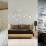
Spanish Bedroom Design: Depth Without Heaviness
The challenge with Spanish-style bedrooms is that the elements most associated with the style, heavy fabrics, carved wood, ornate metalwork, can easily tip into oppressive. The bedrooms that get this right do so by managing light carefully and limiting the ornamental density to one or two focal elements. Everything else in the room should be quiet.
Natural Wood Bed Frames and Why They Anchor the Room
A carved wooden bed frame is the most effective single element for establishing Spanish character in a bedroom. It doesn’t need to be heavily decorated. A frame with a simple arched headboard in dark walnut or chestnut does the job without overwhelming the room. The shaped detail on the headboard is enough to set the visual register.
I’ve seen this work best when the rest of the room is deliberately restrained. White walls, linen bedding in a natural off-white, a single woven textile as a throw, one terracotta table lamp. The bed does the Spanish work; everything else supports it. If you start adding patterned tile alongside an ornate headboard and multiple wrought iron accents, the room starts to feel like a period recreation rather than a contemporary home influenced by the style.
Spanish-style bedrooms also benefit from indirect natural light, which is what small windows create in traditional Spanish construction. In a modern home, sheer linen curtains in a warm cream achieve a similar quality of light without blocking the window. A useful reference: see how Italian interior design handles the similar challenge of Mediterranean warmth without heaviness. Both styles use restraint and negative space in ways that North American interpretations often miss.

Frequently Asked Questions
What are the defining characteristics of Spanish interior design?
Spanish interior design is defined by the contrast between rough and smooth textures, warm and cool tones, and dense material against open space. Key elements include hand-applied stucco walls, terracotta flooring, wrought iron, hand-painted tile, exposed wooden beams, and arched doorways.
How is Spanish interior design different from Italian or Moroccan styles?
All three share Mediterranean roots. Spanish interiors are more architectural, with tile and stucco doing the heavy lifting. Italian interiors use more refined materials and classical proportions. Moroccan design layers more pattern and saturated color in textiles.
What tile patterns are most authentic to Spanish interior design?
The most authentic traditions are encaustic cement tiles with geometric Moorish-derived patterns, hand-painted Talavera ceramics, and simple terracotta quarry tiles for floors. One tile tradition applied consistently does more for authenticity than mixing multiple traditions.
How do I use Spanish interior design in a modern home without it looking dated?
Use Spanish elements functionally rather than decoratively. Stucco texture on walls, terracotta tile on floors, a carved wood bed frame or arched opening integrate into the architecture. Let the Spanish elements be the room itself, not decorative objects layered on top of a modern space.
What are the best paint colors for Spanish interior design?
Spanish interiors use warm whites as the primary neutral. Benjamin Moore OC-17 White Dove and Sherwin-Williams Creamy (SW7012) both carry warm undertones that make white feel sun-washed rather than sterile. For accents, use terracotta sparingly, deep indigo for tile or textiles, and ochre yellow for small pieces.
If you liked this post about Spanish interior design, follow us on Pinterest so you don’t miss any more interior design ideas.