How to Style a Mid Century Modern Dining Room Like a Pro
The mid century modern dining room is one of the most imitated aesthetics in residential interior design, and one of the most frequently misread. I’ve worked on enough dining rooms over the years to say this plainly: most people get one or two elements right and then undo all of it with the wrong chandelier or a table whose leg profile undercuts everything else in the room.
The core of this style comes from a specific period in design history, roughly 1945 to 1969, when American and Scandinavian designers were reducing furniture to its structural logic. Form follows function. Materials should be honest. Furniture should sit low and breathe. Those principles are what hold a mid century modern dining room together. Understand them and the room starts making its own decisions.
The Table Is the Actual Anchor
I always tell clients to choose the table first. Not because it’s the most expensive piece (though it often is), but because every other decision follows from it. Chair height, rug dimensions, pendant position, the amount of art on the walls: all of it is calibrated against the table.
Why the Silhouette Matters More Than the Material
The defining feature of an MCM dining table isn’t walnut veneer or hairpin legs. It’s the silhouette. Specifically, it’s the relationship between the tabletop and its support structure. The table should look like it’s floating, or at least like the structural minimum is holding it off the floor. Splayed legs, tapered legs, a pedestal base: all accomplish this in different ways.
When I was redesigning a dining room in Wicker Park a few years back, my clients wanted a solid farmhouse table. I understood the instinct. Solid objects feel permanent. But visual weight in an MCM space works against you. The table I convinced them to try was a walnut-top piece with angled hairpin legs. Lighter-looking table, more open room. They kept it. The Saarinen tulip table in marble or laminate achieves the same floating effect with a pedestal base and is one of the most reliable choices in this style.

Round vs. Rectangular: the Decision That Shapes the Room
This comes down to one practical question: what do you want this room to do? Round tables encourage cross-table conversation. Rectangular tables create a head-and-foot dynamic that is more formal and better suited to larger gatherings.
For dining rooms under 200 square feet, I almost always recommend round. A round table with a pedestal base keeps the floor plane readable. You can move around it without corners catching you. For rooms where you’re regularly seating six or more, a wide rectangular walnut plank table with tapered legs is one of the most satisfying pieces in the MCM vocabulary. It has mass and material honesty at the same time.


The Glass-Top Problem (and How to Avoid It)
Glass-top dining tables read as 1990s contemporary, not mid century modern. The occasional exception exists: Saarinen’s marble tulip is one. But clear glass with chrome or steel legs pulls any MCM room toward hotel lobby in a single purchase. The material logic breaks. MCM tables should feel like the materials are doing something structural, not disappearing.

If you want something lighter-looking than solid wood, a marble or stone top in a warm tone works far better. It has physical presence without visual heaviness, and it stays within the honest-materials principle that defines the style.

Chairs Are Where Most MCM Dining Rooms Go Wrong
The chair is where MCM dining rooms either commit to the look or hedge. I’ve seen spaces where the table is correct and the chairs pull everything down because the profiles are wrong or the mixing is accidental. The chair is the piece people interact with the most in a dining room. It should earn its place.
The Wishbone Chair Does More Than One Thing
Hans Wegner’s Wishbone Chair (technically the CH24 or Y Chair) is the most consistently recommended MCM dining chair, and for good reason. The Y-shaped back and woven cord seat give it the right proportion, the right materials, and the right visual weight for the style. It’s also stackable, which matters more than people admit.

What surprises clients is how adaptable it is. I’ve used it in rooms that lean Danish, rooms that lean 1970s California, and rooms that are strictly MCM. The chair doesn’t insist on one look. For a warm-toned wood dining room, the natural Beech version is the starting point. The black version reads colder but works well in rooms with darker floors and higher contrast. If you’re also designing the adjacent mid century modern living room, the same principle applies: choose a chair type and commit to it rather than mixing by default.

The Eames Chair Problem
The Eames DSW (Dowel Side Chair) is the most photographed MCM dining chair in the world. That’s part of its problem. It’s become so associated with a certain aspirational interior photography aesthetic that using it in an MCM dining room can make the space feel like a styled shoot rather than a room where people actually eat.
That said: when it’s right, it’s genuinely right. The molded plastic seat has real structural intelligence. The base engineering is honest in the way MCM furniture should be. If you use it, pair it with a table that has its own visual confidence: solid walnut, a statement base, something with material mass. Pair it with a lighter table and both pieces compete for the same visual territory.
For clients who want leather at the table, a low-back armchair with tapered wood legs tends to age better than full Eames shell chairs in leather. The shell chair in leather can look dated faster than the same chair in molded plastic or fabric.

When Mixing Chair Styles Actually Works
Mixing chair types in an MCM dining room works, but only when the mixing is deliberate. Two side chairs plus two armchairs at the ends: that’s a composition. Eight identical chairs: also a composition. Three of one type plus one bought on clearance that’s approximately similar: that reads as an oversight, not a design decision.
Color can differentiate without breaking the visual language. Upholstered chairs in the same silhouette but different fabric tones create distinction without visual confusion. The structure holds the room together; the surface does the personality work. The yellow chairs in the image below are a good example of this: the structural form is consistent, the color is doing something specific.

Lighting Is What Commits You to the Style
MCM dining room lighting is the element that most clearly signals whether you understand the aesthetic or are approximating it. The chandelier or pendant above the table is, in most rooms, the first thing visitors notice when they walk in. Get it wrong and the furniture is working against resistance.
Sputnik Fixtures: Right Rooms, Wrong Rooms
The Sputnik-style chandelier (starburst arms radiating from a central sphere, each ending in a small bulb) is the MCM lighting fixture most people recognize immediately. I’ve installed a few and I’ll be direct about them: they work when the room has ceiling height of at least nine feet, enough visual contrast in the surfaces below (dark walls or floors that give the fixture something to read against), and when the fixture doesn’t have to compete with a busy table surface.

In rooms with lower ceilings, a Sputnik fixture feels aggressive rather than atmospheric. The one I saw installed in an eight-foot-ceiling dining room made the space feel occupied rather than illuminated. The fixture itself was fine. The room wasn’t the right host for it.

Globe Pendants and What Actually Matters at the Table
The globe pendant (a single sphere or cluster of spheres on brass or black hardware) is the more adaptable MCM lighting choice. It scales with the room, doesn’t compete with the furniture below, and can be sourced at a range of price points without the price difference being visible in the room.

What matters more than the fixture type is hanging height. The bottom of the pendant should sit roughly 30 to 36 inches above the table surface. Too high and the fixture looks unmoored from the table. Too low and the light becomes a practical problem: people can’t see across the table without the fixture interrupting their sightline. I’ve had to correct this on more than one client project. It’s worth measuring the position before you finalize the ceiling plate location, not after.

The Credenza as a Working Piece, Not a Prop
What a Credenza Is Actually For
The MCM credenza is, in most interior design photography, a decorative surface with a few objects on top. In actual dining rooms, it should be storage. Tablecloths, serving pieces, extra glassware, the wine you’re not opening yet: that’s what goes inside. A credenza used purely as a display shelf is a piece of furniture working at about a third of its capacity.

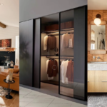
The original mid century credenza (from Herman Miller, Knoll, or Danish designers like Hvidt and Mølgaard) was designed for storage efficiency in smaller postwar apartments. Tapered legs, sliding doors, interior shelving organized for specific objects. Using that structure as a still-life platform while the interior stays empty misses what the piece is for. The same storage-first logic guides mid century modern kitchen cabinetry, where the honest relationship between form and function is equally visible.

Sideboard vs. Credenza: the Proportion Question
The terms are used interchangeably, but they’re not the same object. A sideboard typically stands higher and holds its own visual weight. A credenza sits lower and feels more integrated into the wall. The distinction matters for proportion in the room.
In a room with high ceilings or generous square footage, a sideboard can anchor a wall effectively. In a dining room under 250 square feet, a lower credenza keeps the eye moving and doesn’t compress the space. I’ve seen too many tall sideboards in compact dining rooms where the piece closed off the wall instead of supporting the overall layout. When in doubt, go lower.

Color, Walls, and the Details That Hold the Room Together
The MCM Color Palette Was Never Neutral
There’s a persistent idea that mid century modern means walnut and white walls. That’s the safe version. The actual MCM palette was specific: avocado green, burnt orange, mustard yellow, teal, ochre. These colors weren’t chosen for energy or personality in the way color is often justified today. They were there because the designers understood that furniture with clean, minimal lines needs color to define the zones of a room.
I worked on a Chicago dining room where the client wanted to keep everything neutral: white walls, natural wood table, gray upholstered chairs. Technically correct. Completely inert. We painted one wall in deep forest green behind the credenza. The furniture changed entirely. It stopped looking like objects arranged in a room and started reading as a composition. If you’re designing a mid century modern bedroom with the same palette constraints, the single accent wall approach works equally well without overwhelming a sleep space.

Using Wallpaper Without Over-Theming the Room
Geometric or abstracted botanical wallpaper can work well in an MCM dining room, but it requires restraint. One accent wall, not four. The pattern should belong to the period: atomic motifs, overlapping circles, stylized organic forms that echo the aesthetic rather than parody it.

Wallpaper paired with natural wood furniture adds a layer of material warmth that MCM rooms sometimes lack. The wood grain, fabric upholstery, and patterned wall surface triangulate each other. The pattern isn’t competing; it’s completing the room’s surface range. The room still reads as MCM rather than as “a wallpaper room.”

What Goes Above the Credenza
The wall above the credenza is one of the most loaded decisions in any MCM dining room. Most people hang a single large print and consider it done. It works, but there’s a stronger version: a pair of identically framed pieces positioned to create visual balance with the credenza’s asymmetrical hardware or drawer arrangement. The composition becomes intentional rather than incidental.

MCM-appropriate art leans toward abstract expressionism (actual period work or credible contemporary references), graphic prints from the Eames era, or architectural photography in black and white. The art should look like it was chosen by someone who understood the period. If the same piece could hang in a coastal cottage or a farmhouse kitchen without anyone noticing, it’s not quite the right choice for this room.
Frequently Asked Questions
What makes a dining room mid century modern rather than just modern?
Mid century modern dining rooms are defined by specific furniture profiles: low seating with tapered or splayed legs, honest use of natural materials like walnut and leather, and a palette that uses muted tones with occasional bold accents. Contemporary modern design shares some traits but typically lacks the period-specific furniture forms and material logic that make MCM identifiable at a glance.
Is walnut the only wood that works in a mid century modern dining room?
Walnut is the most commonly associated wood and reads well with the period aesthetic, but it’s not the only option. Oak works in Scandinavian-leaning MCM rooms and teak was common in Danish designs from the same era. The key principle is using wood with visible grain that shows its material nature rather than painted or lacquered surfaces that conceal it.
How high should the pendant light hang over an MCM dining table?
The standard guideline is 30 to 36 inches between the bottom of the fixture and the table surface. In rooms with ceilings taller than 10 feet you can go slightly higher, but the fixture should remain visually connected to the table rather than floating independently above the space.
Can mid century modern dining furniture mix with other styles?
MCM furniture mixes well with other mid-20th century styles that share its principles: clean lines, natural materials, low visual profiles. Scandinavian and Danish Modern pieces sit naturally alongside MCM because they come from the same design movement. Ornate antiques and heavily industrial styles don’t share enough visual logic to work in the same room.
What floor covering works best in a mid century modern dining room?
Natural hardwood floors in walnut, oak, or similar warm tones are the most compatible with an MCM dining room. Low-pile area rugs in solid tones or geometric patterns work well for defining the dining zone in an open-plan space. Thick shag rugs and heavily patterned Oriental-style carpets shift the room’s tone away from the MCM aesthetic.