Mid Century Modern Bathroom: Design Principles That Actually Work

Most bathrooms that call themselves mid century modern are doing something like it, but not quite right. I’ve walked through renovations that had the walnut vanity, the geometric floor tile, the brass hardware, and still felt off. The proportions were wrong. The tile pattern competed with the vanity. The light fixture was trying to be Sputnik but coming across as retail store. Getting the mid century modern bathroom right is less about individual pieces and more about understanding why the originals worked.
The style runs from roughly 1945 to 1969 and pulled from the same principles driving the furniture and architecture of the era: natural materials, honest construction, geometric precision, and a refusal to ornament for ornament’s sake. In a bathroom, that translates to specific choices in tile, hardware, vanity form, and lighting. Those choices have to work together, not just coexist.
The Vanity Is the Centerpiece: Start There
Most bathrooms earn or lose the mid century modern label at the vanity. The period’s key markers are consistent: low profile, tapered legs or a floating wall-mount, warm wood grain, and hardware that registers as a detail rather than a statement. The vanity shouldn’t announce itself. It should function as the room’s quiet anchor.
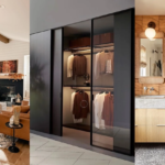
Wooden Vanity with Tapered Legs: Why the Silhouette Matters

The sideboard-style vanity with tapered legs has a specific visual logic: it lifts the eye, creates a sense of ground beneath the piece, and gives the space breathing room. What makes it mid century rather than generic is restraint. No decorative molding, no raised panel doors, no carved hardware. The brass pulls here keep it grounded in the period without overplaying it. The circular mirror above is the right counterpoint to the rectangular case; geometric contrast at the right scale lands as composition, not confusion.
When White and Wood Look Intentional, Not Default

I’ve seen this combination go wrong more often than right. The problem is usually that the wood is too generic: a medium-brown laminate that registers as “renovation” rather than “period.” What makes this work is that the grain is specific, actual walnut or teak with visible color variation. The white elements function as neutral support, and the wood functions as the actual decision. Worth noting: mid century bathrooms rarely used dark wood. The period palette ran from honey oak to warm walnut. Anything ebonized is a different visual language entirely.
The Floating Vanity in a Compact Bathroom

I’ve recommended the floating vanity to three different clients with bathrooms under 50 square feet, and it’s consistently the choice that works. It’s a legitimate period reference (wall-mounted cabinetry came out of the postwar obsession with space efficiency), and it performs geometrically in small rooms. The open floor beneath creates a visual impression of more floor area. Pair it with larger-format floor tiles rather than small mosaics; small tiles in a small room emphasize the room’s scale rather than counteracting it.
The Tile Question Every Mid Century Bathroom Has to Answer
Here is something most renovation guides won’t tell you: in a mid century modern bathroom, the tile is the design. Not the vanity, not the fixtures. The tile. The period was obsessed with geometric precision at small scale, and the bathroom was where that obsession played out most fully. Your tile choices will determine whether the room looks coherent or just assembled.
Bold Patterned Floor, Neutral Walls: The Distribution Rule

The key principle here is that pattern needs a rest point. When the floor is doing significant geometric work, the walls need to step back. This bathroom gets that right: the bold tile pattern on the floor is given room to register, while the walls stay white. If you’re unsure how to distribute pattern, start with the floor. It’s where mid century designers traditionally put their most expressive choices, and it’s the surface you can most easily reconsider if it’s too much.
Multi-Color Geometry: The Period’s Boldest Move

This is the more aggressive interpretation. The multi-color geometric floor is a direct period reference, think 1950s Italian ceramic, and it works because the other surfaces are controlled. The first time I used a pattern this saturated on a bathroom floor, the client was visibly nervous right up until the grout dried. The contrast against a simple white wall is exactly what makes it successful. Remove the white walls and replace them with anything pattern-forward and you’ve lost the room.
Subway Tile Done Right: What Makes It Period-Correct

Subway tile is the most frequently misapplied choice in the mid century bathroom. The original use was purely practical: easy to clean, light-reflective, economical to install. In a period context it looks intentional when paired with correct hardware and geometry elsewhere in the room. Used alone as a stylistic shortcut, it looks like a generic renovation. The matte black trim in this example keeps it from feeling contractor-grade. Heritage Tile and Ann Sacks both make subway tile in the correct glaze profiles for period applications, and the slightly uneven surface matters more than most people expect.
The Vertical Stack That Corrects Low Ceilings

Most subway tile goes in horizontal brick pattern. The vertical stack is a different visual argument: it makes the wall look taller. In low-ceiling bathrooms, which describes a significant portion of mid-century homes built between 1945 and 1965, this is a practical correction rather than just a style choice. Try both patterns in your planning stage before committing. The same tile in a different orientation produces a meaningfully different room.
When You Cover More Surface Than You’d Expect
One of the underappreciated aspects of authentic mid century modern bathrooms is their commitment to surface. The period’s designers weren’t afraid of pattern on the floor, on the walls, and wrapping around the shower enclosure simultaneously. The difference between this and visual chaos is in the geometry: when you’re using consistent shapes throughout, the eye registers it as pattern rather than noise.
Floor-to-Ceiling Hexagons: The All-In Approach

The hexagon tile applied floor to ceiling works because the shape repeats consistently and the eye accepts the repetition as deliberate. In practice, the grout color matters enormously here. White grout in white hexagons produces a field; dark grout in white hexagons produces a grid. Both are valid period references and they create very different spaces. I’ve installed both. The dark-grout version ages better and stays legible as the room evolves around it.
Mixing Tile Types Without Making It Look Confused

Mixing tile types in the same bathroom is trickier than it looks. The failures come from combining tiles that compete: two patterns of similar visual weight, or three different scales fighting for attention. The successful approach is hierarchy: one dominant field tile, one accent treatment, and then hardware and fixtures that don’t add a third visual layer. This bathroom works because the floor pattern is clearly dominant and the wall tile recedes into support.
Earth-Tone Browns as a Period Reference

Warm brown as a primary bathroom tile color is specifically a mid century reference. The postwar American palette ran heavily to ochres, terracottas, and warm browns, the decade’s answer to the prewar taste for cool institutional whites. Brown tile in a contemporary bathroom can come across as dated if the rest of the room isn’t doing period-correct work. Get the vanity profile, the hardware, and the light fixtures right, and the same tile looks historically grounded.
The Pastel Argument
Pastels in a bathroom divide my clients reliably in half. Half ask for them; half recoil at the suggestion. The mid century case for pastels is genuinely strong: soft blue, dusty pink, and sage green were part of the decade’s optimistic color language, and they appear throughout the original bathroom tile work of the 1950s. The risk is that they tip into “vintage bathroom” rather than “mid century modern.” The distinction is in the geometry and the restraint applied everywhere else.
Muted Blue Scalloped Tile: When Pastel Carries Shape

This works because the pastel color is secondary to shape: the scallop profile is doing most of the design work. I’d use this approach only in a bathroom where the other surfaces are genuinely neutral, no warm wood competing for attention, no patterned floor running underneath. The scallop tile as the singular design statement is a confident, concentrated choice. Pair it with brushed brass or matte gold hardware rather than chrome; chrome next to a soft pastel turns clinical fast.
Dusty Pink That Looks Considered, Not Nostalgic

Contrary to what most contemporary design coverage implies, dusty pink in a bathroom is not a trend. It was present in the mid century palette from the very beginning, and it returned partly because original 1950s pink bathrooms have held up well. The version that works now is desaturated: not bubble gum, not powder, but the faded-rose that appears in original period tile work. Find it in a matte or satin finish rather than glossy, and let it be the only statement color in the room.
Wood Paneling and the Warmth Problem
Every mid century modern bathroom risks coming across as cold. The geometry, the tile, the clean lines, handled without a counterweight, produce a space that feels clinical rather than resolved. Wood paneling is the counterweight the period’s designers used most consistently, and it’s the element most contemporary renovations skip. That’s usually the reason an otherwise correct room still feels wrong.
Natural Wood Paneling That Stays Warm Without Going Rustic

Warm-grain walnut applied as panel looks specifically mid century because walnut was the decade’s signature wood. It’s worth understanding why: walnut has enough variation in grain to look organic, but its color range, honey to dark brown, was considered modern in the 1950s, in contrast to the earlier use of oak and pine. Keep the profile simple. Inset panels and routed edges push you toward craftsman territory, which is a different conversation entirely.
The Lower-Half Paneling Technique That Designers Actually Use
Applying paneling only to the lower half of the wall introduces warmth and material contrast without requiring a full wall commitment. It’s also practical when plumbing access is a factor. The visual break at roughly chair-rail height is a structurally sound composition: two distinct zones, each with clear character. I’ve used this in three projects where full paneling wasn’t possible, and in each case it shifted the room’s temperature from clinical to period-appropriate.
Lighting and Hardware: The Details That Confirm the Style
A mid century bathroom with correct tile and vanity but generic contractor lighting isn’t quite there. The period’s lighting is recognizable: globe sconces in milk glass or clear glass, Sputnik-derived pendants, sculptural forms that referenced the space-age optimism of the era. Hardware follows the same logic: warm metals, simple profiles, no decorative casting. These are the final decisions that confirm or undercut everything else in the room.
Brass Globe Sconces: The Lighting Choice That Confirms the Decade

Brass and milk-glass globe sconces flanking a mirror are the period-correct choice for bathroom lighting. They serve the functional requirement of mirror-level illumination, which most flush-mounted ceiling fixtures fail at, while looking deliberately mid century. The specific detail: the globe should be opaque or semi-opaque, not clear glass. Clear glass tends to look more contemporary than period. Idlewood Electric and Hudson Valley Lighting both produce sconces in this profile that are correct for the application without being reproductions.
The Sputnik Pendant in a Larger Bathroom

Using a Sputnik-derived pendant in a bathroom is a committed choice. It works when the room is large enough to handle a hanging fixture, minimum 8-foot ceiling, ideally 9, and when the rest of the room has enough restraint to let it function as the focal point. In a smaller bathroom, the same spirit is better captured with a multi-arm sconce at mirror level. The Sputnik as the room’s organizing gesture works; the Sputnik competing with an already-busy tile floor does not.
Polished Brass Against Dark Tile: The High-Contrast Play

Polished brass hardware against dark tile is the high-contrast version of the mid century metal choice, and it works for the same reason brass against walnut works: warm against cool, organic against architectural. Newport Brass makes bathroom hardware in period-appropriate profiles, simple round bases and lever handles without ornament, that look correct in this context without resorting to reproductions. The finish will patinate over time. That’s a feature, not a problem.
Warm Metal Running Through the Whole Room

Carrying the same metal finish from hardware to light fixtures to mirror frame is a different approach: less contrast, more material coherence. I’ve seen this perform better than the high-contrast approach in smaller bathrooms, where the eye needs simplicity more than drama. The brass feels warm throughout the room rather than popping as an accent, and the overall effect is quieter but still specifically period. Both approaches are correct. The question is what the rest of the room is already asking for.
When Mid Century Meets Coastal Design
The mid century modern and coastal combination is a legitimate hybrid. Both share core values: natural materials, simplicity, openness. Where mid century brings geometry and precision, coastal brings a light palette and organic texture. The hybrid fails when both are happening simultaneously, a patterned tile floor plus a rope mirror plus driftwood accents, rather than one informing the other. One style sets the structure; the other provides color direction.
The Coastal-MCM Hybrid: What Actually Holds It Together

What works here is structural clarity: the wood vanity and geometric floor tile are mid century, and the coastal element is kept to the color palette rather than introduced through additional objects. The circular mirror could have pushed it toward beachy; instead, the geometric form works as a complement to the rectangular vanity. The same logic that works in the bathroom extends to the mid century modern bedroom. When you’re working across rooms, consistent geometry and metal choices hold the home together better than matching furniture sets.
Blue-and-White Geometry Without the Coastal Clichés

Blue-and-white tile in a geometric pattern is the cleanest version of coastal-MCM. It references the ocean without resorting to shell motifs or reclaimed wood. The mid century element is the geometry: the pattern is doing the same work a patterned floor does in a more purely period room. If you’re thinking about how to extend this language across the home, the mid century modern kitchen handles the same blue-white-wood combination in a way that translates well from room to room.
Understanding the full mid century modern bathroom logic also clarifies storage decisions. The period’s approach to bathroom closet design followed the same principle as the vanity: low profile, open shelving where possible, no decorative concealment. Restraint in decoration, honesty in material, and geometry as the organizing structure, that logic applies throughout the style.
Frequently Asked Questions
What are the key design elements of a mid century modern bathroom?
The core elements are a vanity with tapered legs or floating wall-mount in warm wood (walnut, teak), geometric tile as the primary design statement, warm metal hardware in brass or bronze, and period-appropriate lighting such as globe sconces or Sputnik-derived pendants. These elements need to work together. Getting three right and one wrong usually shows.
What tile works best in a mid century modern bathroom?
Geometric options are most authentic: hexagon mosaic, patterned cement tile, or subway tile applied in vertical stack. The tile should carry the room’s design weight. Pick one strong tile choice and keep everything else neutral. Mixing multiple patterned tiles without a clear hierarchy produces confusion rather than character.
Should a mid century modern bathroom use warm or cool colors?
The period used both. Cool pastels (soft blue, sage green, dusty pink) and warm earth tones (ochre, terracotta, warm brown) were both period-correct. The choice depends on the light in the room. Cool pastels need strong natural light to avoid looking clinical. Warm earth tones work in rooms with less light and pair well with walnut vanities.
What hardware finish is correct for a mid century modern bathroom?
Brass, bronze, and unlacquered copper are the period-appropriate choices. Polished brass looks high-contrast and bold; brushed or aged brass looks quieter and more residential. Avoid chrome unless the rest of the room is very cool in palette. Chrome typically looks contemporary rather than period in this context.
Can you achieve mid century modern in a small bathroom?
Yes. Use a floating wall-mount vanity to preserve visual floor space, keep to one strong tile choice rather than mixing patterns, and use mirror-level globe sconces rather than a ceiling pendant. The compact scale forces the restraint that mid century design calls for anyway.