Free Shipping On All Orders
Balance in Interior Design: 5 Key Principles for Effortless Harmony
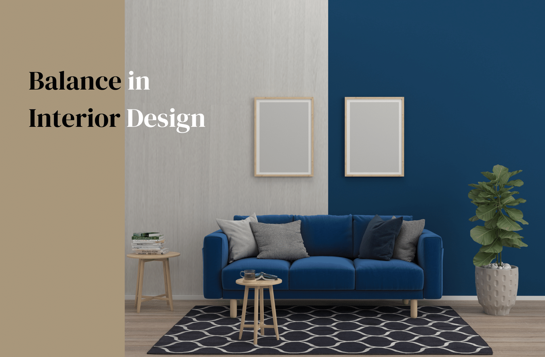
Balance in interior design is a crucial aspect of creating harmonious, functional, and aesthetically pleasing spaces. It is achieved through the thoughtful distribution of visual weight within a room, ultimately contributing to a sense of stability and cohesion. By incorporating balance as a guiding principle, designers and homeowners alike can curate spaces that are both inviting and visually engaging.
Understanding balance in interior design involves considering various factors such as shape, color, pattern, texture, and spatial distribution. With each element serving to support or counterbalance one another, the space can feel more organized and easy to navigate. Additionally, there are different types of balance—symmetry, asymmetry, and radial—that can be employed depending on the desired aesthetic and function of the space. By taking these principles into account throughout the design process, one can create a well-balanced environment that caters to the user’s lifestyle and preferences.
Key Takeaways
- Balance in interior design contributes to creating visually engaging and harmonious spaces.
- Considering various factors such as shape, color, and spatial distribution is crucial in achieving balance.
- Different types of balance (symmetry, asymmetry, and radial) can be employed based on the desired aesthetic and function.
Understanding Balance in Interior Design
It is important to understand Balance in interior design to create a harmonious and aesthetically pleasing space. Balance refers to the equal distribution of visual weight within a room, which is crucial for designing all interior spaces. Achieving balance provides the basic flow of the room and creates a sense of calm and order.
There are three different types of balance in interior design: symmetrical, asymmetrical, and radial. Symmetrical balance is achieved by arranging elements in a mirrored or evenly spaced layout. This often involves placing identical objects on either side of a central point, such as a fireplace or a piece of artwork. Symmetrical balance in interior designpromotes a feeling of formality and order, making it ideal for more traditional spaces.
On the other hand, asymmetrical balance in interior design involves arranging elements in an irregular layout, with objects of different sizes and shapes placed throughout the space. This type of balance is more dynamic and works well in contemporary settings. Although it may feel less orderly than symmetrical balance, it is important to maintain a sense of equilibrium by ensuring that no single area feels visually heavier than another. To achieve this, I might use a mix of small and large objects, different textures, and contrasting colors.
Radial balance revolves around a central point, wherein elements are arranged in circular or spiral patterns. This type of balance can create a strong focal point and adds a sense of unity to the space. For example, a round dining table with chairs spaced evenly around it is an example of radial balance.
In my experience, incorporating these different types of balance can really enhance the overall design of the space, making it a more inviting and appealing environment. Whether I’m designing a formal living room or a casual family space, I focus on maintaining visual balance by distributing furniture, lighting, and decorative elements evenly across the room. This ensures that every area is engaging and visually well-coordinated, reflecting a harmonious and pleasing atmosphere.
Types of Balance
Symmetrical Balance in Interior Design
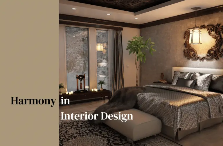
In interior design, symmetrical balance refers to the arrangement of elements in a room that are mirror images of each other, creating a sense of equilibrium and harmony. This can be achieved through the use of furniture, decor, and architectural features, such as placing identical chairs on either side of a fireplace or using matching lamps on either side of a bed. Symmetrical balance is often considered formal and is commonly seen in traditional interiors, but I’ve found that it can also be applied to contemporary design as long as the overall aesthetic is cohesive.
Asymmetrical Balance in Interior Design
Asymmetrical balance, on the other hand, involves the placement of non-matching elements with equal visual weight, yet still achieving a balanced look within the space. This type of balance can be more dynamic and exciting, and it requires a keen eye to find the right balance between different pieces and design elements. In my experience, asymmetrical balance can be achieved through the use of contrasting colors, textures, and shapes, while still maintaining a level of consistency within the overall design. For example, I might use a large piece of artwork on one wall, which is counterbalanced by a grouping of smaller framed pieces on the opposite wall. This creates visual interest and maintains a sense of harmony in the room.
Radial Balance in Interior Design
The third type of balance is radial balance, which is often found in nature, such as in the petals of a sunflower. In interior design, radial balance involves the arrangement of elements in a circular pattern, emanating from a central point. This type of balance creates a soothing, harmonious feeling, and I’ve observed that it’s often used in feng shui practices, as it is believed to bring positive energy to a space. Examples of radial balance in interior design include circular tables surrounded by evenly spaced chairs, or a centrally positioned light fixture with surrounding decorative elements that radiate outward.
Understanding and incorporating the different types of balance—symmetrical, asymmetrical, and radial—into my interior design projects has allowed me to create spaces that are visually appealing, cozy, and harmonious, whether I’m working with traditional, contemporary, or eclectic styles. Utilizing these principles helps ensure that each room not only looks great but also feels balanced and inviting for those who inhabit the space.
Achieving Balance through Design Elements
Color
When working with color in interior design, I always aim for a harmonious blend. Selecting a color palette, whether it’s the primary colors or a mix of complementary and analogous colors, helps create a sense of balance throughout the space. I keep in mind that dark colors can visually “weigh down” a room, while light colors can make it feel more spacious and airy.
Texture
In my designs, I incorporate a variety of textures to achieve balance. Too many smooth surfaces can make a room feel cold and uninviting, while too many rough textures can be overwhelming. By mixing different materials like wood, metal, fabric, and stone, I create a visually interesting and balanced atmosphere.
Pattern
Patterns can greatly impact a space’s balance. I use them with caution, as too many patterns can create visual clutter. When incorporating patterns, I stick to a cohesive theme and try to limit their use to specific areas, such as accent pillows or an area rug. This helps distribute visual weight and maintain balance within the design.
| Pattern Type | Recommended Usage |
|---|---|
| Bold | Accent pieces |
| Subtle | Larger areas |
Scale and Proportion
Scale and proportion are crucial elements in achieving balance. When selecting furniture and accessories, I always consider their size and relationship to the surrounding space. Oversized pieces can overpower a room, while smaller items can get lost in the design.
- Large furniture: anchor the design and should be balanced with smaller pieces
- Small accessories: create accents and visual interest, but could be overwhelmed by larger items
By maintaining a balanced combination of elements in these key areas – color, texture, pattern, and scale and proportion, I can create a harmonious and visually pleasing interior design.
Spatial Distribution and Balance
In interior design, achieving balance is crucial for creating a harmonious and aesthetically pleasing space. One way to create balance is through spatial distribution. This involves placing your furniture, objects, and visual elements in such a way that they distribute visual weight evenly across your space. This can be achieved using various techniques and layouts, such as symmetrical and asymmetrical balance.
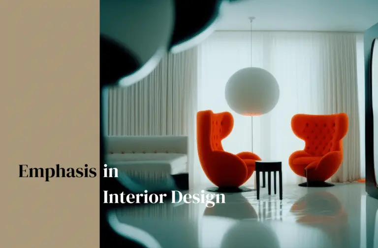
Symmetrical balance in interior design refers to the arrangement of design elements in a mirror-image style. For example, placing two armchairs on either side of a coffee table creates symmetry, generating a sense of order and stability. This layout works well in areas where a calm and formal atmosphere is sought, such as living rooms and dining rooms. Using symmetrical arrangements can enhance the sense of tranquility and proportion in these spaces, providing a visually pleasing and relaxing environment.
On the other hand, asymmetrical balance is achieved by using different shapes, colors, or sizes of elements while still maintaining a feeling of equilibrium. This type of balance is more flexible and dynamic than its symmetrical counterpart, allowing for a more creative and imaginative spatial distribution. In this context, I might choose a large artwork on one wall and offset it with a group of smaller pieces on another, or place a bold-colored piece of furniture within a more neutral space. Asymmetrical balance can add movement, excitement, and visual interest, making it suitable for casual and modern spaces.
When it comes to creating balance through spatial distribution, considering scale, proportion, and flow is important. Large furniture items can be balanced with smaller ones, and tall items paired with shorter ones. Mixing various shapes and forms adds visual interest and helps maintain the overall balance of the space.
Achieving balance in interior design through spatial distribution is an essential aspect of creating a comfortable and visually appealing environment. Deftly combining symmetrical and asymmetrical layouts ensures the optimal distribution of visual weight, simultaneously catering to both formal and casual living spaces. By incorporating these principles, I can successfully craft well-balanced and harmonious interiors.
Utilizing Furniture and Accessories for Balance
In my experience with interior design, I’ve found that furniture and accessories play a crucial role in achieving balance. Here are a few strategies I implement to create a harmonious and visually pleasing space:
Firstly, I consider the room’s focal point. Every room has one main feature that our eyes naturally gravitate towards. For example, in a living room, this is often the TV, and in a bedroom, it is usually the bed. Identifying and working with the focal point helps create a sense of balance in the overall design.
Another approach is using furniture and accessories in various shapes, sizes, and heights. This creates a space with multiple levels, distributing the visual weight evenly around the room. For instance, I may combine a large sofa with a smaller accent chair and a tall floor lamp to achieve this effect.
Asymmetry can also bring interesting balance to a space. By placing varied objects on either side of a central point, I create a thoughtfully arranged setting that still feels evenly weighted. A good example of this is using mismatched sofas, accent chairs, and side tables in a living room while maintaining balance with symmetrical wall elements.
In addition, I pay close attention to the scale and proportion of furnishings and décor. Large furniture pieces can be balanced with smaller accessories or artwork, while heavier items can be offset by lighter, airier elements. Selecting items carefully based on their size and proportion ensures the room doesn’t feel too cluttered or overwhelming.
Color and texture are essential components for achieving balance in interior design. I often use a mix of complementary and contrasting colors, as well as different textures, to create visual interest and harmony. By incorporating some of these strategies, it is possible to utilize furniture and accessories effectively to create a well-balanced interior design.
Creating Focal Points and Visual Interest
In interior design, balance is vital for establishing a sense of stability and harmony in a space. One effective way to create balance is by designing focal points that grab attention and evoke visual interest. A focal point can become the center of a room, and it serves to keep the eye engaged and guide the viewer throughout the space.
I often advise using contrasting textures, colors, and carefully selected furniture pieces as focal points. For example, a striking piece of artwork can become a room’s focal point and anchor the entire design. Other architectural features like fireplaces or large windows can serve this purpose as well.
Creating such focal points and incorporating visual interest is not limited to just one element in the room. Accents can be added to enhance depth and personality in a space. Using a pop of vibrant color or introducing an eye-catching pattern are excellent ways to create accents that add character to the room without sacrificing balance and harmony in interior design.
With emphasis in interior design, it’s crucial to remember an essential concept: the Golden Ratio. This concept helps to achieve the desired balance by using an invisible axis, stemming from the center of the focal point, and distributing the room’s elements symmetrically.
Designing a balanced interior involves creating visually impactful focal points and incorporating contrasting textures, colors, and patterns to generate visual interest. Focusing on these aspects allows me to create harmonious spaces that are both functional and aesthetically pleasing.
Considering Functionality and Lifestyle
When designing a balanced interior, it’s essential to consider functionality and lifestyle. I believe that a well-designed space should accommodate everyday needs while reflecting personal style and preferences. In order to achieve this, it’s crucial to keep in mind the following aspects:
Firstly, analyze the purpose of each space. Determine the primary functions and requirements for the rooms in your home. This will help identify which design elements to prioritize, allowing for a functional and comfortable environment.
Next, assess your personal lifestyle and habits. Are you someone who loves to entertain, or do you prefer a quiet, cozy atmosphere? Knowing your lifestyle preferences will influence decisions on factors like furniture layout, storage solutions, and color schemes.
It’s also important to evaluate your material and finish choices. Based on your preferences and lifestyle, select materials that are durable and easy to maintain. For example, if you have children or pets, opt for stain-resistant and easy-to-clean surfaces. This not only ensures longevity but also keeps your space looking polished.
Keep practicality and comfort top-of-mind when making design decisions. For example, choosing ergonomic furnishings can impact how you spend time in a space. Be conscious of proportions, invest in quality pieces that cater to your needs, and don’t be afraid to mix and match various styles to create a cohesive balance.
By integrating these considerations into your design approach, you’ll be able to create a space that is not only visually balanced but also functionally attuned to your unique lifestyle.
Common Mistakes and Solutions
In my experience, one of the most common interior design mistakes is using the wrong scale. A room can look cluttered and messy with too many small items or feel stuffy with an overload of bulky pieces. The solution is to mix and match the scale of the pieces in the room for a more balanced appearance.
Another frequent mistake I’ve seen is not balancing the layout of a room. A poorly planned interior can lack both visual appeal and practical flow. My advice is to always plan and measure before arranging furniture, taking into consideration foot traffic and aesthetics. Remember that the perfect balance of design and function in your room can be achieved by creating a natural flow of movement while ensuring that each item complements the other visually.
I’ve also noticed that people often push furniture against the walls in their rooms. While at times this can work, it often leads to a predictable and static appearance. To refresh your space, try pulling your furniture away from the walls and creating conversation areas that are more inviting and visually engaging.
Not measuring furniture before purchasing and bringing it into a room is another common mistake I’ve encountered. Measuring is essential to avoid under- or over-scaled pieces in the space. Be sure to check the dimensions of your room and the furniture you intend to buy, so they fit together harmoniously without overcrowding the area.
Achieving balance in interior design involves avoiding these common mistakes and implementing the right solutions. By mixing scale, balancing layout, arranging furniture appropriately, and measuring your pieces, you’ll be on your way to creating a well-designed and harmonious space.

