Clever Interior Design Ideas: The Ones That Actually Make a Difference

I was down a YouTube rabbit hole on a Tuesday night when I landed on Rebecca Robeson’s home renovation series. She’s a professional interior designer who documented every decision she made remodeling her own house, and it’s the kind of video you watch twice because there’s too much to absorb the first time. What struck me wasn’t the results. It was the specifics. Not “update your lighting,” but exactly which lights she replaced and why the pendant placement over the island mattered.
I’ve pulled apart her approach and tested the pieces that translate to regular houses and real budgets. Some of these I’ve done myself in my Austin rental. Others I’ve adapted into cheaper alternatives that get you 80 percent of the result. Here’s what actually holds up.
The Kitchen Hack That Costs Less Than You Think
Before: A Wall of Cabinets That Cut the Room in Half

After: Open Layout with Espresso-Painted Cabinets

The original kitchen had an overhead bank of cabinets running across the middle of the room, effectively turning one connected space into two disconnected boxes. Rebecca’s first move was removing them entirely, which immediately opened the sightline from the kitchen into the adjoining room. That alone changed how the space felt.
The second move is the one I keep thinking about: instead of replacing the existing oak cabinets, she painted them espresso. The existing cabinet boxes were structurally fine. She just changed the color and the perception. The result looks like a considered design decision, not a compromise. In my experience, painting cabinets is the single highest-impact, lowest-cost move available in a kitchen. Benjamin Moore Kendall Charcoal and Sherwin-Williams Gauntlet Gray are both worth testing on a cabinet door first. Dark colors are less forgiving of surface imperfections, so prep time matters more than the paint itself.
She also replaced the overhead fluorescent lighting with canned lights and added pendant fixtures over the island. This is where the room goes from functional to inviting. The first thing I’d change in any kitchen with flat, uninviting lighting is the fixture placement, not the cabinet hardware. A $120 pendant over an island does more visual work than $600 of new pulls and knobs. If you’re looking for where to begin with interior design basics, lighting is almost always the right starting point.
Why Lighting Is the Most Misunderstood Hack
The Same Room, Before and After Lighting Changes


Most people treat lighting as a checkbox: there’s a fixture, it works, done. The before-and-after in this case makes the argument better than words can. Same room, same furniture, same paint. The lighting difference makes one version feel like a rental unit and the other like somewhere a person actually thought carefully about how to live.
Overhead lighting from a single central fixture is almost always the wrong choice for a living space. It flattens shadows, kills depth, and makes the room feel like a waiting room. Layered lighting, a combination of overhead, task, and ambient sources at different heights, is what creates that finished quality most rooms are missing. This isn’t expensive knowledge. It’s just not what big-box stores sell by default.
In my current Austin place, I replaced one generic flush-mount with a plug-in pendant (no electrician, no landlord permission required) and added two table lamps at eye level. The room didn’t get a new coat of paint or any new furniture. It just got three light sources instead of one. The difference was immediate. I’ve recommended the exact same approach to several friends who asked why their living rooms didn’t feel right. Lighting is almost always the problem. The piece on making an apartment look more intentional covers a few other quick-turn moves worth knowing.
For the vintage-window-as-borrowed-light trick Rebecca used in her entryway: she found an old window at a garage sale, opened a hole in the wall, and hung it on hooks and eye screws. The result is an architectural detail that moves daylight from an adjoining room into a dark hallway. In a rental, you can’t open a wall. But a glass-paneled interior door or a large mirror placed to reflect an existing window does similar work. The principle is the same: move light between spaces rather than just adding more fixtures.
The Entryway Problem Nobody Talks About
A 10-Foot Arched Mirror as the Focal Point

The Entryway After: More Space, More Light


Most entryways have the same problem: they’re either too small to do anything with, or too generic to leave an impression. Rebecca’s solution was to go tall and bold. She installed an arched 10-foot mirror surrounded by eight-inch casing, added a transom with crown molding above the doorway to fake a higher ceiling, and brought in a vintage window for borrowed light. The result is an entryway that feels architectural rather than transitional.
The principle here is that one oversized element does more work than five smaller ones. A single dramatic mirror, a tall console, one statement pendant. When I moved into my current apartment, the entry hall was the standard narrow rectangle with nothing going for it. I leaned a six-foot floor mirror against the far wall (IKEA Hovet, around $130) and that was the whole design decision. It doubled the perceived width, bounced light from the window behind me, and gave the space some actual presence. Visitors comment on it more than anything else in the apartment.
The molding trick is also doable on a budget. Adding simple picture-frame molding to the lower half of an entryway wall costs under $50 in materials and a weekend afternoon. It creates the same eye-movement effect: your gaze goes up, and the ceiling reads as higher. I’d skip the complicated transom and just do the wainscoting-style framing. Same visual logic, accessible to anyone who has access to a miter saw at their local hardware store rental counter.
Mirrors as an Optical Design Tool
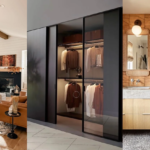
Cabinet Fronts Covered in Mirror

Covering the fronts of cabinets or closet doors with mirror panels is one of those ideas that sounds excessive until you see it done well. When the floor runs continuously into the mirror’s reflection without a gap or baseboard break, your eye reads the space as larger than it is. It’s not a trick so much as a matter of visual continuity. The brain fills in what it expects to see.
Contrary to what most decorating advice suggests, mirrors don’t need to be centered or symmetrical to work. What they need is scale and placement that references a light source. A mirror that faces a window multiplies daylight. A mirror that faces a wall just shows you the wall. The first time I understood this, I moved a mirror I’d had for two years from behind a sofa to the wall opposite a window. Completely different effect, no new purchase required.
For cabinet fronts specifically: this works best on flat, recessed-panel faces. You can source mirror tiles from a tile supplier or order pre-cut mirror acrylic from a local plastics shop. Acrylic is lighter and won’t shatter if a cabinet swings open hard. At around $15 to $25 per square foot depending on thickness, it’s a mid-range project but a permanent improvement that photographs well and adds perceived square footage to any room.
What the Staircase Can Tell You About Your Whole House
Before: Straight Run with a Standard Pony Wall

After: Curved Run with Custom Iron Railing

The original staircase was a straight run with a pony wall, the kind you’d find in virtually any American tract home built in the 1990s. Functional, inoffensive, completely invisible. Rebecca rebuilt it with a curved run and commissioned custom iron railings, and the difference is dramatic in the most architectural sense: the staircase stopped being background and became foreground. It’s the kind of change that makes the whole house look different from a single renovation.
The budget version of this is worth being honest about. Custom iron railings can run $3,000 to $8,000 depending on the artisan and complexity. If you’re not in that position: replacing dated wooden balusters with pre-made metal spindles is a genuine weekend project. Pre-made metal baluster sets are available at home improvement stores in the $80 to $150 range for a standard staircase, and they change the visual weight of the railing in a meaningful way. The staircase gets lighter, the sightline through it opens up, and the room alongside it benefits without touching a single structural element.
The mixed-wood-floor choice, light downstairs and espresso upstairs, is more interesting to me than it first appears. Interior design convention says to match floors throughout for cohesion. Rebecca ignored that convention because the espresso upstairs matched her dark-wood furniture, and the result works because both choices were intentional. The boundary at the stair landing marks a tonal transition rather than looking like a mistake. This is worth thinking about if your upstairs and downstairs genuinely have different functions. Understanding why harmony in interior design works the way it does helps you know when bending a rule adds character instead of chaos.
Hiding Doors: The Design Decision That Pays for Itself
Before: The Door Breaks Up the Wall

After: The Door Disappears Into the Wall

Doors break up walls. A hallway with three visible doors in a row looks cluttered even if the rest of the room is minimal. The before-and-after here is striking because the door doesn’t disappear entirely — you can still find it if you know where to look — but it stops demanding visual attention. The wall reads as a wall again.
The techniques: painting and texturing the door to match the adjacent wall, replacing the hardware with a touch latch, and running the baseboard continuously across the door face. That last detail is the one that sells it. Our brain uses baseboards as a reference line for where the wall ends. When the baseboard runs uninterrupted across the door, the whole plane reads as wall. The touch latch replaces the handle so there’s no hardware to signal that anything is there. The result isn’t invisible, but it stops being the first thing you notice when you walk into the room.
The version of this I’ve actually done is simpler: I removed a bifold closet door in my bedroom that was obstructing the floor space whenever I opened it and replaced it with a curtain rod and a linen panel. Cost around $40. The closet is technically open now, but the panel gives it a visual edge. It doesn’t swing out and block a third of the floor every time I need something. The key question is always whether a door needs to be a door. For small room setups, removing or replacing doors is one of the most accessible ways to reclaim floor area without touching a wall.
Frequently Asked Questions
What are the most impactful clever home hacks for a small budget?
Lighting changes and cabinet painting give the highest return for the lowest cost. A $120 pendant fixture or a $30 can of dark cabinet paint will change the feel of a kitchen more than most furniture purchases. Start there before spending money on anything decorative.
How do you make an entryway look bigger without structural changes?
One oversized mirror placed to reflect a window or light source does more than any arrangement of smaller decor. The floor should run continuously toward it without a rug break interrupting the reflection. Adding simple picture-frame molding to the lower wall is a budget version of the transom molding trick that gets most of the visual result.
Is it possible to hide a door without hiring a contractor?
Yes, with some conditions. The door needs a flat panel face for paint and texture to work properly. Touch latches replace standard hardware and are available for $15 to $30 online. Running the baseboard across the door face is a weekend project if you have access to a miter saw. The door won’t be invisible, but it will stop reading as a door from across the room.
What is the budget alternative to a custom iron staircase railing?
Pre-made metal balusters from a home improvement store can replace dated wooden ones for $80 to $150 for a standard staircase. You will need to drill into the treads, so it is a step above a simple DIY project, but the visual result is similar: a lighter, more open railing that changes how the room alongside the staircase feels.
Do floors need to match on different levels of a house?
Convention says yes, but it is not a rule worth following without thinking through why. If your furniture and palette on each level are distinct, different flooring can mark a tonal boundary rather than look like an oversight. The key is that both choices need to be intentional, and the transition at the landing needs to look planned rather than accidental.