2000s Interior Design: What Actually Defined the Decade

I found an old HGTV episode from 2003 buried in my YouTube recommendations last winter, and I could not stop watching. Frosted glass cabinet doors. Stainless steel everything. Beige walls with a single accent wall in muted sage. The host kept saying “clean lines” like it was a personality trait.
Here’s the thing: I recognized half of that apartment. Not because I had seen it before, but because my first place in Austin in 2019 still looked exactly like it. The previous tenant had decorated it sometime around 2007 and never really changed anything, and I spent eight months deciding which parts were dated and which were actually kind of brilliant. A lot of 2000s interior design holds up better than its reputation suggests, and some of it was genuinely ahead of its time.
The “Less Is More” Phase That Required More Than It Looked
Minimalism That Was Harder to Pull Off Than People Remember

Early 2000s minimalism gets mocked now, but I think people forget how radical it felt at the time. We were coming out of the postmodern interiors of the 1990s, which had (generously) a lot going on. Heavy drapes, wallpaper borders, decorative plates on every available wall surface. Minimalism was a direct reaction to all of it, and if you want to understand the design era it was reacting against, post-modern interior design is a useful starting point.
The challenge was that actual minimalism requires real commitment. Clean lines look intentional when everything in a room is chosen deliberately. They look chaotic when you have kids, a hobby that generates clutter, or anywhere between three and twenty-seven throw pillows. My Austin apartment had a minimalist aesthetic the previous tenant had clearly worked hard to maintain, judging by the complete absence of storage. Every surface was visible. Every object was deliberate. And then I moved in needing somewhere to put my things.
What did hold up from early 2000s minimalism is the idea of edited spaces. Not empty rooms, but chosen ones. Three things displayed with intention instead of thirty collected with sentiment. That principle is still sound. The frosted glass and chrome-legged furniture executing it are optional.
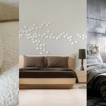
Neutral Walls That Were Doing More Work Than We Gave Them Credit For

The beige era has a terrible reputation. I want to defend it anyway.
A warm beige or soft cream wall is genuinely one of the most forgiving backgrounds you can work with. It makes natural light look better. It makes wood furniture read warmer. It doesn’t fight with art, plants, or textiles added later. In my current house, I have one room with white walls and one with a warm greige, and the greige room photographs better every single time. That wasn’t an accident.
What the 2000s got wrong wasn’t the neutral walls themselves. It was the matching-everything-to-the-walls approach. Beige walls with beige couches with beige carpet with beige curtains. Monochromatic neutrals looked cohesive in catalog photography and deeply sad in real life. The correction that actually worked was keeping the neutral base and adding texture and contrast through materials, not just more color. The walls were never the problem.
The Materials That Actually Defined the Decade
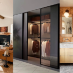
Stainless Steel: What Held Up and What Didn’t
The rental I lived in from 2021 to 2023 had a full stainless steel kitchen: appliances, range hood, backsplash, and one stretch of counter edging. I have formed opinions about all of these.
The stainless steel appliances were excellent. Still current-looking, easy to clean on the main surfaces, and they signaled “this is a real kitchen” in a way that mattered when I was actually cooking there daily. The backsplash was a different experience entirely. Every fingerprint was visible. Every water splash left a mark. I wiped it down every day and it still looked slightly smudged by evening. The decision to extend stainless across the backsplash turned a routine task into something that required actual daily attention.
The 2000s enthusiasm for stainless steel was not wrong as a concept. It was the application that sometimes overcorrected. Appliances: still a solid call, especially for kitchens that get real use. For the backsplash, the version that holds up without the maintenance commitment is subway tile, which runs around $5 to $12 per square foot installed and photographs just as cleanly without revealing every moment of kitchen activity.
Glass Surfaces That Looked Better in the Showroom Than at Home

I bought a glass coffee table in my late twenties and kept it for two years before I gave up. Glass-top dining tables, coffee tables, and end tables were everywhere in 2000s interiors, and the appeal makes sense. They’re visually lightweight. They don’t interrupt light moving through a room. In a small space, they let the floor show through, which gives the impression of more square footage than you actually have.
They also show everything. Every water ring, fingerprint, crumb that lands below the surface. If you dislike cleaning furniture, glass surfaces will find this out about you. I learned this about myself in year one of ownership and remained in denial until year two.
The glass elements that held up from 2000s design were the architectural ones: glass partitions, glass-paned doors, transom windows. These do exactly what the minimalist instinct promised: they open a space without adding visual weight. A glass panel between a living room and dining area still works in contemporary interiors. A glass coffee table in a house with children and pets is an optimistic choice.
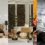
Natural Materials That Were Ahead of the Conversation

Reclaimed wood was a design choice in the 2000s before it became a branding category on Etsy. Indoor plants started appearing in mainstream design coverage well before “plant parent” became a social media identity. Stone countertops moved from aspirational to expected over that same decade.
What I find interesting looking back is how much of this was driven by sustainability conversations that were just entering mainstream awareness. Reclaimed wood was about not buying new things as much as aesthetics. Bamboo flooring appeared as an eco-friendly alternative to hardwood at a time when most people hadn’t considered flooring as an environmental decision at all. Indoor plants were recommended primarily for air quality, not Instagram.
The 2000s naturalism had a different visual character from what we do now. It tended toward rough and rustic where current versions tend toward refined and intentional. But the underlying idea that homes should connect to natural materials rather than purely synthetic ones was correct, and design has followed that direction consistently since.
The Styles That Made 2000s Homes Memorable
Shabby Chic Done Right Versus Shabby Chic as a Distressed Paint Shortcut
Shabby chic is easy to imitate badly because the visual shorthand is simpler than the actual design logic. Distressed white paint, some ruffled textiles, a soft palette. It’s possible to assemble all of those elements and end up with something that looks like a set rather than a room.
The genuine version layers vintage and cottage elements in a way that feels lived-in rather than assembled. Things that look aged because they’ve been used, not because a factory applied fake wear. Linen slipcovers that have been washed many times. Genuine vintage finds from actual secondhand shops. Rugs that started out patterned and faded naturally over years.
I bought a “distressed” white nightstand off a sale shelf that looked fine from across the room. Up close, the wear marks were in places where real furniture never wears, because the distressing had been applied by a machine following a repeating pattern. For the real effect on a piece you already own, Annie Sloan chalk paint in Old White, applied and lightly hand-sanded after drying, gets you significantly closer for around $40 a tin. The key is sanding at corners and edges where actual wear would occur, not across flat surfaces where it would never happen.
The Retro Revival That Started a Longer Design Conversation

By the mid-2000s, there was a visible wave of 1950s, 60s, and 70s references in interior design. Tapered furniture legs reappeared. Tulip table shapes showed up in updated versions with contemporary materials. Bold geometric patterns came back in textiles, usually in colors that felt current rather than historically accurate.
This wasn’t pure nostalgia. It was the first wave of a longer conversation about whether good design from earlier decades was worth revisiting rather than simply replacing. That conversation continued through the mid-century modern revival, which if you’ve been following interior design content for any length of time you know is still ongoing. The 2000s retro moment was an early chapter of something that turned out to be sustained. The interest in retro futurism interior design grew from this same instinct, taking historical references and asking more specifically what made them work.
What the 2000s Got Right That We Tend to Overlook
Personalization Before It Got Replaced by Algorithm Aesthetics
What I kept noticing in that 2003 HGTV episode was how personal the better homes looked. Decorative objects that clearly meant something to the person who lived there. Family photos that weren’t arranged as a gallery wall template from a decor account. Accumulated spaces rather than curated ones.
The 2010s and early 2020s produced the clean, photogenic interior. Open shelves with three objects chosen for visual weight and color. Gallery walls with matching frames in a consistent palette. Rooms that photograph beautifully and feel slightly impersonal to actually inhabit. There’s a reason people now talk about “anti-aesthetic” spaces as a direct reaction to this.
The 2000s impulse toward objects with personal meaning was correct, even when the execution got cluttered or the taste dated. Most of what makes a space actually work comes down to a consistent set of principles that hold regardless of decade. If you want to think about what separates a space that functions well from one that just photographs well, interior design basics is a useful place to ground that thinking.
Sustainability Before It Had a Marketing Campaign
The mid-2000s interest in reclaimed materials, energy-efficient lighting, and indoor plants was happening before any of it had a lifestyle brand attached to it. Compact fluorescent bulbs were not considered stylish in 2006. Choosing reclaimed wood furniture was an ethical and budget decision as much as an aesthetic one. Plants were recommended for air quality first and photography second.
Most people encounter sustainable design as a current trend. The instinct has been in mainstream interior design for over twenty years. What changed is the visual language, the marketing around it, and the price point of products claiming it. For a current read on which interior design trends have real staying power versus which are following a familiar cycle, it’s worth distinguishing between genuinely new ideas and things that have simply been renamed.
Frequently Asked Questions
What defined 2000s interior design?
2000s interior design was shaped by minimalism, neutral color palettes, and natural materials like reclaimed wood and stone. Stainless steel appliances, glass surfaces, and open floor plans were common, alongside styles like shabby chic and a mid-decade retro revival drawing from 1950s and 60s aesthetics.
Is 2000s interior design coming back?
Some elements are. The neutral base palette, natural materials, and tapered furniture legs from the retro revival are all current again in various forms. Others, like frosted glass cabinet doors and stainless steel backsplashes, have stayed dated. Design rarely returns wholesale: specific elements get reappraised one at a time.
What colors were popular in 2000s interior design?
Neutral tones dominated: warm beige, cream, light gray, and soft sage. The trend favored muted, cohesive palettes over bold color statements. Accent walls appeared mid-decade as a way to add visual interest without committing to a full room color change.
What furniture was typical in 2000s interior design?
Low-profile sofas with clean lines, glass-top coffee and dining tables, and chrome-accented pieces were common in the minimalist trend. The retro revival brought back tapered legs and curved forms from earlier decades. Shabby chic spaces used distressed white painted wood and upholstered pieces in linen or cotton.
How do I add 2000s elements to my home without it looking dated?
Focus on what aged well. A warm neutral wall color, reclaimed wood accents, and quality stainless steel appliances all hold up. Skip frosted glass cabinets, overly matched monochromatic schemes, and factory-distressed furniture. The underlying principles were often sound even when the specific products weren’t.