Parisian Style Interior Design: 8 Principles That Actually Work

Most people trying to achieve a Parisian look get stuck on the wrong things. They reach for ornate furniture, layer in too many accessories, and wonder why the result feels more cluttered than continental. I have seen this happen in nearly every project where a client comes to me with a Pinterest board labeled ‘Parisian Inspiration’ and a fundamental misunderstanding of what that aesthetic actually requires.
The Parisian style interior design isn’t about abundance. It’s about a specific set of decisions – about light, materials, restraint, and the few objects that genuinely deserve space. What follows are the eight principles I return to consistently when working with this aesthetic. They aren’t decorating tricks. They’re the structural logic behind why these interiors look the way they do.
The Color Logic: Why Parisian Interiors Start with Light
The strongest misconception I encounter is that Parisian interiors are simply ‘neutral.’ That description misses the point. The color strategy here is specific: it starts with light, not with the absence of color. The foundational palette – warm whites, soft beiges, creams with a slight yellow undertone – is chosen because it maximizes how natural light moves through a room.
Light Colors Are Not the Timid Choice
When a client came to me wanting a Parisian bedroom but kept gravitating toward charcoal and navy, I had to push back. Dark colors create drama, but they absorb light rather than move it. In a Parisian-influenced room, the goal is the opposite: the walls become almost luminous, acting as a surface that amplifies daylight coming through tall windows.
The practical recommendation: start with a white that has a warm undertone, not a cool blue-white. Something in the Benjamin Moore White Dove range (OC-17) reads as warm and genuinely inviting rather than clinical. If you want soft pastels – pale blush, dusty sage – they can work, but they need to stay in the low-saturation range. What disrupts this aesthetic most quickly is contrast: a dark wall in a room built around light.
Layering Neutrals Without Losing Depth
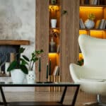
The reason Parisian interiors don’t read as boring despite the restrained palette is texture. A linen sofa against plaster walls with a silk throw pillow and a rough-hewn wooden side table creates visual complexity without any change in hue. That interplay between materials is doing the work that most people try to do with color.
I learned this on a renovation in Lincoln Park where I held the wall color to a warm off-white but hadn’t thought carefully enough about material contrast. The result was technically correct but flat – it had no presence. The fix was replacing a velvet armchair with a raw linen piece beside a marble surface. The shift was immediate. For a deeper look at how material relationships create visual cohesion, the post on harmony in interior design covers the formal principles behind this.
Art, Gold, and the Objects That Tell a Story
Parisians have a relationship with objects that I find genuinely instructive. They don’t decorate – they accumulate, over time, things that mean something. An oil painting inherited from a grandparent, a small bronze figure from a flea market, a stack of books that actually gets read. The difference between a room that feels Parisian and one that looks like it’s trying to is almost entirely in this: do the objects have history, or do they just have price tags?
The Art Wall Done the Parisian Way
The gallery wall approach common in North American interiors – evenly spaced frames, all the same depth, often purchased as a set – is the opposite of what works here. Parisian art arrangements are asymmetrical, mixed in scale, and genuinely eclectic. A small oil nude next to a large black-and-white photograph next to a framed vintage poster gets closer to the mark. The detail that matters most: don’t hang everything at the same height.
Parisian interiors tend to let art drift lower toward the furniture, creating a connection between surfaces and objects rather than treating the wall as a separate category. When I specify art placement for clients going for this aesthetic, I use the 57-inch center rule as a starting point and then deliberately break it for variety and visual rhythm.
Gold Accents: Where Less Actually Means More
Gold is genuinely part of the Parisian design vocabulary – but the way it’s used is widely misunderstood. It’s not a finish applied uniformly to cabinet hardware, light fixtures, and picture frames. It appears selectively, in places where it has weight: a gilded mirror above a fireplace, a single brass candlestick, the handle of an antique writing desk.
Contrary to what most decorating sources suggest, matching your metals is actually the wrong instinct for this aesthetic. A mix of antique gold, aged bronze, and raw brass reads more authentically than a coordinated set. I point clients toward antique markets for individual pieces with genuine patina – in Chicago I rely on Broadway Antique Market regularly for this. If buying new, unlacquered brass develops a patina over time and reads more convincingly than polished gold-tone finishes.
Materials and Structure: What the Floor and Walls Communicate
There’s a reason you can often identify a Parisian apartment from the floor alone. Herringbone hardwood, wide-plank oak, or stone tile with inlaid patterns – the flooring is not an afterthought. It’s often the oldest element in the room, which is exactly what gives it authority. This is an aesthetic where you build around what already has history.
Marble and Wood Serve Different Functions
Both materials appear frequently in Parisian interiors, but they aren’t interchangeable. Marble is cool, formal, and light-reflective – it works in kitchens, bathrooms, and as tabletop surfaces where its temperature and density make sense. Wood is warm, tactile, and grounding – it belongs on floors and in furniture with softer profiles. Mixing them is intentional in Parisian design: a marble-topped console table on a herringbone oak floor creates the kind of material tension that reads as considered. What doesn’t work is substituting one for the other wholesale. A full marble floor in a bedroom loses the warmth that makes the space function. An all-wood kitchen without stone surfaces misses the material contrast that makes the room interesting.

Architectural Details as the Design Backbone
Moldings are not decoration in the traditional Parisian apartment. They’re structural – they define proportions and create visual rhythm that the furniture then works within. When I take on a project in an older building, I always investigate what’s been covered up. Painted-over crown moldings are common, and restoring them is almost always worth the cost. In new construction where these details don’t exist, you have two options: add them, or choose a design strategy that doesn’t depend on them. A contemporary space can carry a Parisian-adjacent aesthetic by leaning into material contrast and art curation without the architectural vocabulary. But if the bones are there, use them. The post on interior design basics addresses proportional framing in more depth if you’re working from scratch.
The Restraint Principle: What You Leave Out Matters
The advice I give most often to clients who want this look but can’t quite reach it: edit harder. The instinct when decorating is to add – another pillow, another lamp, another plant. Parisian interiors work because someone has made deliberate decisions about what doesn’t belong. The room contains only what it needs.
This is also what most people mistake for minimalism, and it’s worth being precise about the difference. True minimalism is radical reduction – nearly nothing in the space. A Parisian interior has texture, layering, collected objects, and personal details. But it doesn’t have excess. Each thing in the room earned its place, and you can feel that. The curation is the skill, and it’s the hardest part to teach.

The Details That Make It Feel Real, Not Staged
Fresh Flowers as a Design Reset
Flowers in a Parisian interior aren’t styling – they’re a recurring practice. This is actually one place where I’d push back on the restraint principle: fresh flowers, changed weekly, are worth the cost and the upkeep. They introduce organic shape and impermanence that staged rooms can’t replicate, and they signal that a space is genuinely inhabited.
The choice of flower matters more than most people think. I’ve found that tulips with slightly bent stems, arranged loosely in a ceramic pitcher rather than a formal vase, capture the feeling more accurately than a perfect florist arrangement. Anemones and ranunculus work similarly. What to avoid: tropical flowers, anything too architectural in structure, anything that looks like it came from a corporate lobby. The goal is abundance that looks gathered quickly, not arranged carefully. For thinking about live plants more broadly, the post on interior plant design covers how to use greenery as a recurring design element rather than a one-time addition.
Books as Objects, Not Just Content
Books stacked on a coffee table or arranged on a shelf are doing visual work whether you realize it or not. In Parisian interiors, they tend to be oversized art books – photography, architecture, fashion – that have visual presence as objects, not just text on a spine. The practice of stacking three books horizontally, different sizes, with a small sculptural object placed on top, is one of the most reliable styling moves I know – and it’s not pretentious when the books are ones you actually engage with.
The note I’d add: resist buying books purely for their covers. The Parisian connection to books is genuine – these are people who read, whose shelves show use and accumulation over time. You’ll recognize immediately the difference between a shelf that belongs to someone and one that was purchased for a photo shoot. Aim for the former.
Frequently Asked Questions
What makes Parisian style interior design different from French country style?
Parisian style is urban, layered, and eclectic – it mixes antique and modern pieces in a neutral palette with high ceilings and architectural details. French country style is warmer, more rustic, and relies on natural textures like terracotta and rough linen. The key difference is setting: one belongs in a city apartment, the other in a farmhouse.
What is the most common mistake people make with Parisian style interiors?
Over-decorating. The aesthetic depends on restraint – every object in the room should have a reason to be there. Most attempts fail because people add too much rather than editing down. A Parisian room has personality, but it isn’t crowded.
How do I choose the right white for a Parisian-style room?
Avoid cool, blue-toned whites – they read as clinical in this context. Look for whites with a warm undertone, slightly toward ivory or cream. Benjamin Moore White Dove or a similar warm white in the 85-90% white range works well. Test it against natural light in the room before committing.
Can Parisian interior design work in a modern apartment without period architecture?
Yes, but it requires adjusting the approach. Without moldings and high ceilings, lean into the material contrast strategy and art curation instead. A herringbone floor, a well-chosen gallery wall, and disciplined editing will carry the aesthetic further than trying to retrofit architectural details that don’t belong.
Is Parisian style interior design expensive to achieve?
Not necessarily. The key elements – neutral paint, edited furniture, art arrangements, fresh flowers, and a few carefully chosen objects – don’t require large budgets. The expense comes from buying too much rather than too little. Antique markets and secondhand sources often produce better results than high-end retailers for this aesthetic.
If you found this guide on Parisian style interior design useful, follow us on Pinterest for more interior design ideas and inspiration.