Steampunk Interior Design: Materials and Proportion First

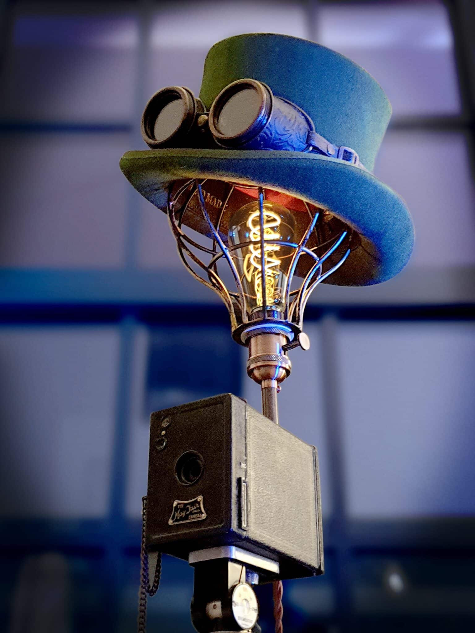
Most steampunk rooms fail before a single gear goes on the wall. Clients bring me loft photos and ask for the look, then point at a chandelier that would need a twelve-foot ceiling to breathe. Steampunk interior design is a materials and proportion problem first. Theme comes last, if at all.
I treat the style as Victorian verticality meeting industrial honesty: dark wood at human scale, metal as trim, leather with real grain. in a city apartment apartments that already have brick and exposed steel, the architecture does half the work. My job is to keep the decor from shouting over it. If your layout is still wrong, fix that with interior design basics before you buy brass.
Proportion Before Props
Nineteenth-century rooms were taller and denser than a typical 8-foot rental. Steampunk interior design that ignores that gap ends up with furniture that looks glued on. I measure ceiling height and clear circulation before I approve any tall clock, pendant, or sculptural fixture.
One heavy piece per zone anchors the story: a solid console, a leather club chair, a thick-legged desk. Light-legged everything makes the industrial cues look like stickers. Sightlines from the entry matter too. If the first object is a novelty gear wall, the room reads as a set, not a home.
One homeowner in a a walk-up neighbourhood walk-up who wanted a brass cage chandelier over a four-person table. The cage barely cleared standing height. We swapped for a lower, warmer fixture and put the budget into one good leather chair instead. The room finally felt intentional instead of theatrical.
Metal as Accent, Not Armor
Brass, copper, iron, and steel belong at edges: lamp bases, brackets, switch plates, fireplace tools. When every surface goes metallic, steampunk interior design collapses into a hardware catalog. I pick one dominant metal temperature and one secondary note. Random chrome beside polished brass fights itself.
Patina forgives real life. Mirror-polished brass shows every fingerprint and ages like a hotel lobby. Brushed or lightly aged finishes hold up in apartments where people actually cook and host. Literal gear stacks only work as singular sculpture. Twenty small gears on a shelf is a junk drawer with branding.
Leather, Wood, and Soft Counterweight
Leather needs matte grain. High-gloss vinyl kills the workshop story instantly. Wood tones need hierarchy: walnut or oak for case goods, related trim, darker seating. Orange pine beside cherry beside espresso laminate is not eclectic. It is unfinished decision-making.
Textiles keep the room livable. Wool throws, tweed pillows, and drapes that stack cleanly soften metal without turning the brief into a parlor redo. A rug that can take foot traffic grounds the seating so chairs do not float on bare floor. Balance in interior design applies here in the most literal sense: hard materials need soft mass.
Light That Does Not Flatten the Room
Cool overhead grids erase leather texture and make brass look cheap. I specify warm sources you can see: shaded floor lamps, wall sconces with visible arms, a low table glow for faces. Dimmers are not optional in rooms that mix dark wood and metal.
Walkthrough videos like this are useful for material cues, not for copying every prop. I watch for how light hits metal and wood, then close the tab and edit the client’s fixture schedule. Inspiration without a scale check is how you end up with a film-set chandelier in a nine-foot room.
Layout for Living, Not Display
Conversation geometry beats vignette furniture. Two chairs that face each other with a solid side table outperform a sofa aimed at a wall of gadgets. Paths need shoulder width. Radiators, door swings, and window clearances kill more steampunk fantasies than bad taste does.
Storage should look built, not piled. Closed cabinets hide the modern mess (chargers, mail, plastic). Open shelves get one curated row, not a museum of thrift finds. If you cannot name why an object is visible, it goes behind a door.
the city Lofts Versus Tight Apartments
Brick and beam rooms already speak industrial. There I subtract more than I add: one metal lighting story, one leather seat, wood that matches the existing tones within a step. White-box apartments need more structure first, tall case goods and warm light, before any Victorian reference.
People who love darker period drama often arrive from Victorian Gothic interior design mood boards. Steampunk shares the verticality and the seriousness of materials, but it fails when you import every prop from both boards at once. Pick one load-bearing story.
Walls, Maps, and Visual Noise
Walls in steampunk interior design need discipline. One framed map or technical print can carry a vignette. A collage of gears, clocks, and sepia posters turns the room into a gift shop. I hang art at furniture scale, not ceiling-to-floor sticker height.
If the palette is already dark, borrow restraint from dark interior design thinking: empty wall as rest, not wasted space. Metal frames in the same temperature as your lamps keep the eye calm.
Fireplace, Desk, and Built-Looking Storage
A hearth or dark console can act as the room’s horizontal anchor when you lack a real fireplace. I prefer one substantial case piece that could pass for millwork over three small accent tables fighting for attention. Desks need real depth for work, not just a steampunk silhouette for photos.
Long-term care is part of the design brief. Wipe metal with the finish in mind, condition leather on a schedule, and oil wood before it looks thirsty. A style built on honest materials fails the week you stop maintaining them.
What I Refuse on Client Projects
I refuse novelty clocks that tick loudly in small bedrooms, plastic gears sold as metal, and lighting that only works on camera. I also refuse matching steampunk furniture sets. The look needs to feel collected over time, even when we buy it in one season.
Budget order that actually holds: lighting and one seating piece first, then case goods, then small metal accents. Props last. If the first three are wrong, no amount of brass polish will fix the room.
Test the room at night with only the warm lamps on. If the metal still shouts and the seating feels thin, you bought accents before structure. Reverse that order and steampunk interior design starts to behave like design instead of costume.
FAQ
What I skip when the room is already working
Steampunk interiors fail when every surface becomes a display. If the pipes, the dark wood, and one brass lamp already read, I stop adding hardware. The room needs a quiet wall the same way a factory floor needs a clear aisle.
Does steampunk need gears on the walls?
No. Gears are optional props. Proportion, warm metal accents, and honest leather or wood do more work than novelty hardware.
Can this work in a small apartment?
Yes, if you keep metal as trim and choose one heavy furniture piece per zone. Skip tall fixtures that fight low ceilings.
What metal finish lasts best?
Brushed or lightly aged brass and iron forgive fingerprints better than high polish. Match one dominant temperature.
Where should I spend first?
Lighting and seating. Then case goods. Decorative gears last, if at all.
How do I avoid a theme-park look?
Limit visible novelty objects, close storage for clutter, and keep sightlines from the entry calm. One sculptural metal piece beats a shelf of small props.