Post Modern Interior Design: A Guide to Achieving a Sleek and Minimalist Look

Post modern interior design is the only style I’ve seen generate genuine arguments in a room full of designers. Some call it indulgent. Others call it the most intellectually honest design movement of the 20th century. I’d say both things are partly true, which is exactly what makes it interesting to work with in practice.
The defining quality of postmodernism is that it knows exactly what it is reacting against. Understanding that reaction is what separates post modern design done well from spaces that just look chaotic.
What Post Modern Interior Design Actually Means
A Reaction, Not Just a Style
Postmodernism emerged in the late 1960s and accelerated through the 1970s as a direct response to mid-century modernism. Modernism had produced genuinely beautiful work: clean lines, pared-back color, furniture that prioritized function over ornamentation. It had also produced spaces that felt austere to the point of coldness. The central modernist rule, that form follows function, left little room for personality or historical reference.
Postmodern designers challenged that rule directly. Their counter-argument: form can follow concept, history, humor, or provocation just as legitimately as it follows function. A chair does not need to look engineered. It can look like an architectural reference, an overscaled geometric object, or a piece of theater. Color is not decoration added after the fact; it is argument.
I’ve seen this tension play out in real projects. A client in Chicago’s Lincoln Park neighborhood had a Mies van der Rohe Barcelona chair and a shelf of Memphis-era ceramics, and she assumed they were incompatible. They weren’t. The austere chair made the ceramics look more confident. The ceramics made the chair look less severe. That is postmodern logic working correctly: the contrast is not a problem to solve but the actual point.
The Memphis Group and Why It Matters

The single clearest reference point for post modern interior design is the Memphis Group, founded in Milan in 1981 by Ettore Sottsass. Memphis furniture used laminate surfaces with bold geometric patterns, primary and neon colors, and forms that looked deliberately anti-functional. The Carlton bookshelf, an asymmetrical stepped unit in yellow, red, and blue laminate, became an icon precisely because it was original in a way that had no precedent at the time.
Knowing Memphis matters for a practical reason: it gives you a benchmark for what authentic postmodern furniture looks like versus what is just eclectic. Memphis pieces have an internal logic. The geometry is deliberate. The color choices are argued rather than intuited. If you are sourcing postmodern furniture at vintage dealers or estate sales, that distinction tells you which pieces will hold their ground in a room and which will just look busy.
Other designers worth knowing for historical context: Michael Graves, whose Portland Building (1982) brought postmodern motifs to architecture at civic scale; Robert Venturi, who made the intellectual case for complexity and contradiction in design; and Gaetano Pesce, who worked with unconventional materials and irregular forms well into the 2000s. These references give you vocabulary when you are sourcing or editing a postmodern room.
The Core Visual Language of Post Modern Design

Color as Argument, Not Accent
Postmodern color palettes are not harmonious in the conventional sense. The goal is tension, not balance. Primary red, cobalt blue, and acid yellow appearing in the same space is not a mistake. Neither is a combination of black, white, and a single aggressive pink. What these combinations share is intentionality: each color is present in deliberate relation to the others, not selected because it “goes well.”
In practice, this means you need at least one neutral anchor that holds the room together visually. In most of the successful postmodern interiors I have worked on, that anchor is white walls and a concrete or light wood floor, against which the bolder elements read clearly. Without that anchor, the palette moves from provocative to confusing. Most people get this wrong by starting with too many statement surfaces at once, which removes the contrast that makes each individual statement legible.
Geometric Forms and Layered Patterns
The pattern vocabulary of postmodern design borrows from multiple sources: art deco geometry, pop art graphics, architectural ornament from classical periods distorted and rescaled. The result is layered. A postmodern living room might have a terrazzo floor (geometric pattern at macro scale), a graphic rug (pattern at mid scale), and patterned cushions (pattern at detail scale). This combination is not too much. Patterns at different scales do not compete with each other the way same-scale patterns do.
I learned this the hard way early in my career: I placed two medium-scale geometric patterns in the same room and they produced a visual vibration that was genuinely uncomfortable to look at for any sustained period. Varying the scale is what makes the layering work. This principle applies equally to Art Deco interior design, which also uses geometric pattern heavily but tends to keep the palette more tightly controlled.
Mixing Eras Without a Hierarchy
Postmodernism rejects design chronology as a sorting principle. A Victorian side table, a 1960s Eames fiberglass chair, and a contemporary credenza belong in the same room not in spite of their differences but because of them. The implicit argument is that no design period has authority over any other.
In execution, this requires more discernment than it appears, not less. A reproduction piece that is not particularly well-made will not hold its ground next to a genuine vintage item. The mix has to be a mix of strong pieces. This is also what distinguishes postmodern mixing from modern eclectic interior design, where the combination of styles is often more casual and personal. In postmodern rooms, the history of each piece is part of what is being said.
How to Make Post Modern Design Work in a Real Room

Start With the Palette Before You Buy Anything
The right sequence for a postmodern room is palette first, furniture second. Before committing to any piece, decide which three or four colors are doing the work. Choose one dominant color that covers the largest surface area, one accent that contrasts sharply with it, and one or two supporting tones that bridge them. Constraint at this stage gives you much more freedom later when you are sourcing individual pieces.
The mistake I see most often is choosing bold furniture first and trying to build a palette around it afterward. Postmodern furniture is visually strong on its own terms, which makes it hard to layer. When two statement pieces are both asserting themselves and there is no established palette logic, the room becomes an argument between objects rather than a coherent space with an argument behind it.
Furniture That Reads as Genuinely Postmodern
Postmodern furniture has identifiable visual characteristics: non-standard proportions, materials used with a degree of irony (plastic rendered in a high-gloss finish that reads as expensive; expensive materials used casually), asymmetrical silhouettes, and references to earlier design periods distorted by scale or color. The key principle here is that the piece should have a visual position, not just a function.
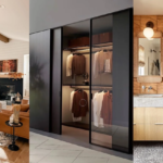
For sourcing, I look first at Italian furniture from the 1980s and early 1990s, which appears regularly at estate sales and vintage dealers at accessible prices. Contemporary brands working in the Memphis tradition include Moooi and Magis, both of which produce well-made pieces with a postmodern sensibility and enough quality to last. For decorative elements, architectural salvage is consistently underused: oversized plaster moldings, terrazzo tile offcuts, and geometric tile in unusual formats all read as postmodern at a fraction of furniture costs.
Surfaces and Materials That Work
Terrazzo is the canonical postmodern surface. It is a composite material that is technically humble (aggregate set in cement) but visually complex. It appears in postmodern interiors as flooring, countertops, and decorative objects. Real terrazzo is expensive to install; terrazzo-look porcelain tile is widely available and visually effective for most residential applications at a significantly lower price point.
Glossy lacquered surfaces are a second postmodern signature. A lacquered cabinet or tabletop has a slightly artificial quality, a surface that clearly was not grown or quarried but manufactured with intention, which suits the style. Glass, chrome, and high-gloss laminate all work for similar reasons. The manufactured quality of these materials contrasts interestingly with organic textures like raw wood or stone, creating visual interest without requiring additional pattern or color to make it work.
Three Post Modern Sub-Styles Worth Understanding
Minimalist Postmodern: Breaking Rules Quietly
Minimalist postmodern design applies postmodernism’s conceptual logic (historical reference, rejection of design hierarchy, deliberate color provocation) within a restrained formal vocabulary. You might see a white room with one Memphis-era lamp, a monochrome geometric rug, and a single bold-colored chair as the statement piece. The room is spare. The argument is still postmodern.
This sub-style works well for people who find the full maximalist version aesthetically exhausting to live with over time but are genuinely drawn to postmodernism’s ideas. It also ages better in terms of livability. Contrary to what most design media suggests, postmodern interiors do not need to be full. A single Memphis lamp in an otherwise restrained room makes a more precise argument than a room where every surface has been given a postmodern piece. The precision is what gives it power.

Eclectic Postmodern: The Approach Most People Actually Use
Eclectic postmodern is the sub-style most visible in current residential design. It involves sourcing pieces from multiple eras and styles, using bold color in targeted ways (an accent wall in an aggressive hue, a single statement sofa against neutral walls), and layering patterns at different scales. It is more approachable than minimalist postmodern because it does not require the same degree of conceptual precision up front.
The risk is that eclectic postmodern becomes an accumulation of things the owner liked rather than a designed space. The difference in practice: when the pieces are in the room together, do they create a relationship? Do they comment on each other in some way? If they simply coexist without any visual or conceptual dialogue, you have collected objects rather than designed a room. The solution is usually to remove two or three pieces and see if the remaining items sharpen into a clearer statement.
Maximalist Postmodern: For the Fully Committed
Maximalist postmodern is the version most people picture when they hear the style named: high-gloss surfaces, patterns competing for visual attention, sculptural furniture at overscale, objects chosen for impact as much as function. This version requires genuine design skill to execute without becoming incoherent, and it requires a genuine commitment to living in a space that is always making a statement.
If you are attempting a maximalist postmodern interior, start with the floor and ceiling and commit to both before adding anything else. Fix those two surfaces in a way you are confident in, and build the room from there upward. The floor and ceiling provide the structural visual logic that gives the bolder elements somewhere to anchor. I’ve found that maximalist rooms that feel like they work almost always have a restrained floor and ceiling, even when everything between them is deliberately chaotic.
For rooms where you want to understand how postmodernism relates to adjacent styles, retro-futurism interior design shares postmodernism’s appetite for bold color and unconventional material choices, and futuristic interior design explores related territory from a forward-looking rather than historically referential angle. Neither is postmodern, but both are useful comparative references when you are working out where your project sits.
Why Post Modern Interior Design Still Divides Designers
Post Modern Interior Design rejects the modernist idea that form should follow function. Instead of clarity, restraint, and visual logic, it often leans into ornament, irony, bold color, asymmetry, and surprise. That is part of its appeal, but also the reason many designers remain critical of it.
Noah Daniel’s argument is that postmodernism was an overcorrection. Modernism could feel cold, but postmodern design often responded by throwing out discipline altogether. In practice, that meant prioritizing visual statements over proportion, usability, and coherence. I think that criticism is fair, especially in interiors where people have to actually live with the result.
That does not mean all postmodern work fails. The style can bring humor, personality, and cultural reference into a space in a way strict modernism often cannot. But the key principle here is that expression still needs structure. Without that, Post Modern Interior Design can quickly feel chaotic, gimmicky, or dated rather than bold.
Daniel also draws an important line between art and design. Art only needs to provoke a reaction. Design needs to function. That is where postmodern interiors often get into trouble. A sculptural chair, an exaggerated lamp, or a playful geometric form may look memorable, but if it ignores comfort, usability, or context, it stops being strong design and starts becoming decoration with an attitude.
My view is simple: Post Modern Interior Design works when it uses its visual freedom with control. It fails when the room becomes a stage for cleverness and forgets the people living in it.
Frequently Asked Questions
What is post modern interior design?
Post modern interior design is a style that emerged in the late 1960s as a direct reaction to mid-century modernism. It rejects strict functional logic in favor of bold color, historical reference, pattern layering, and unconventional materials. It is characterized by a deliberate willingness to mix eras and break design rules with intent rather than by accident.
Who were the key designers in the postmodern interior design movement?
The Memphis Group, led by Ettore Sottsass and founded in Milan in 1981, is the most direct reference point. Other significant figures include Michael Graves, Robert Venturi, and Gaetano Pesce. All worked with historical references, bold color, and unconventional materials in ways that directly challenged modernist conventions.
What furniture works best in a post modern interior?
Italian furniture from the 1980s and early 1990s is the most historically accurate source and is widely available at vintage dealers and estate sales. Contemporary brands like Moooi and Magis produce new work in a related spirit. Look for pieces with asymmetrical profiles, high-gloss surfaces, non-standard proportions, or deliberate historical references. The piece should have a visual position beyond just its function.
Can post modern interior design work in a small space?
Yes, particularly in the minimalist postmodern sub-style. A small room with white walls, one postmodern statement lamp or chair, and a geometric rug at the appropriate scale can make a clear postmodern argument without visual congestion. The key is choosing one statement piece and letting it lead rather than filling the space with multiple bold items.
What is the difference between postmodern and eclectic interior design?
Eclectic design combines styles for personal preference without a particular conceptual argument. Postmodern design mixes eras and elements as a deliberate statement about design history and the rejection of any single period’s authority. In practice: eclectic rooms feel collected; postmodern rooms feel argued.
If you want to keep exploring related styles, check our guides on Pinterest for regular interior design updates.