Prairie Style Interior Design: Horizontal Lines and Honest Materials

Prairie style interior design stretches the eye sideways along horizontal bands: long shelves, low fireplaces, art grouped in linear runs, windows emphasized as wide openings. I fell for it after visiting a Midwest house museum and realizing my Austin rental could suggest the same calm with paint lines and furniture height choices.
The style rejects fake luxury. Materials should read true: oak, plaster, linen, ceramic, glass. Prairie style interior design fails when laminate pretends to be mahogany or when every window gets stick-on lead grid.
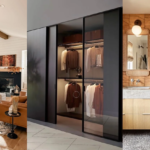
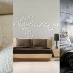
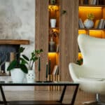
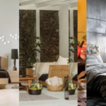
The pins show classic rooms. This article is how to borrow horizontal discipline and honest surfaces on a budget and a lease.
Prairie style interior design rewards patience: align one long line, live with it a week, then add the next band instead of buying decor that fights the architecture.
Horizontal Emphasis on Short Walls
Prairie style interior design uses long low furniture to echo wide horizons. I choose sofas with lower backs and long media consoles instead of tall bookcases on every wall.
Paint color blocks at chair rail height suggest banding without carpentry. One darker lower band and warm upper white changes proportion in rentals.
Art hung in a horizontal row reads prairie faster than one tall vertical piece. Align frames on a shared centerline.
Shelving runs long and low. Tall skinny units fight the style unless flanking a wide window intentionally.
When I apply Horizontal Emphasis on Short Walls in my Austin rental, prairie style interior design should feel easier to maintain, not harder to explain. I test the change for a full week of normal routines, not a weekend photo session. If bags, mail, or dishes break the calm, the layout still needs editing before I shop again.
Windows as Design Anchors
Windows are framed, not hidden. Prairie style interior design treats glass as horizontal picture. I hang rods wide so stacked curtains clear window width when open.
Stick-on lead patterns only if subtle and limited to one room. Over-grid reads craft store.
Bench or low storage below windows uses the ledge zone functionally. Empty ledges miss opportunity.
Sheers diffuse harsh sun without blocking band lines. South Austin light needs diffusion for honest materials to read calm.
When I apply Windows as Design Anchors in my Austin rental, prairie style interior design should feel easier to maintain, not harder to explain. I photograph the room at the same hour for three days so shifting light does not trick me into false confidence about materials or scale.
Wood Tone Honesty
Oak and walnut in clear finish dominate. Prairie style interior design shows grain instead of hiding it. I pick one species tone per room.
Stain should enhance grain, not mask it as plastic. Cheap orange stain ruins the ethic fast.
Built-in look comes from aligning freestanding pieces: bookcases same height, shared top line, common hardware.
Metal accents stay linear: rectilinear pulls, simple sconces, no ornate scroll unless architectural context supports it.
When I apply Wood Tone Honesty in my Austin rental, prairie style interior design should feel easier to maintain, not harder to explain. I walk the path with laundry, groceries, or work gear because prairie style interior design has to survive real life, not an empty showroom walkthrough.
Built-In Thinking Without Carpentry
Modular units ganged with shared top create pseudo built-ins. Prairie style interior design loves continuous lines more than custom price tags.
Window seat illusion: low bench plus cushion plus flanking shelves reads intentional.
Desk and storage along one wall preserve open center floor, a prairie circulation habit.
Hide clutter behind closed lowers, display few objects on open uppers. Balance is discipline, not emptiness.
When I apply Built-In Thinking Without Carpentry in my Austin rental, prairie style interior design should feel easier to maintain, not harder to explain. I ask one honest friend to sit for ten minutes and name the first object they notice. If it is not the focal point I planned, I edit before spending more.
Color: Earth, Wheat, and Autumn Red
Palette pulls from landscape: wheat, sage, terracotta, slate, warm white. Prairie style interior design avoids neon accent.
One autumn red or rust in textile or tile is enough drama. More becomes eclectic fast.
Ceilings stay warm white, not blue-white LED cool. Grain wood hates cold cast light.
Rugs in flat weave with geometric border echo textile history without busy florals.
When I apply Color: Earth, Wheat, and Autumn Red in my Austin rental, prairie style interior design should feel easier to maintain, not harder to explain. I keep a short notes list on my phone: what worked, what annoyed me, what I would repeat. That list beats impulse buys when the room drifts.
Rental and Budget Adaptations
Peel-and-stick chair rail paint prep still needs clean lines and level laser. Wobbly bands look rental hack, not prairie.
Thrifted oak dressers sanded and oiled beat new veneer pretending to be wood.
Lamp shades rectangular or drum with warm light echo architectural geometry.
Explore related cues in interior design styles when prairie meets craftsman overlap in your building.
When I apply Rental and Budget Adaptations in my Austin rental, prairie style interior design should feel easier to maintain, not harder to explain. I test the change for a full week of normal routines, not a weekend photo session. If bags, mail, or dishes break the calm, the layout still needs editing before I shop again.
Fireplace and Hearth Horizontal Bands
Prairie style interior design treats hearth as long low horizontal anchor. Renters fake with low media console and linear art above instead of high TV stack.
Mantel objects in odd numbers with low profile: wide bowl, low candle, horizontal book stack.
Tile surround in earth tones beats busy mosaic unless architecturally original.
Keep tools and screens hidden. Hearth zone should read calm band, not utility closet.
When I apply Fireplace and Hearth Horizontal Bands in my Austin rental, prairie style interior design should feel easier to maintain, not harder to explain. I photograph the room at the same hour for three days so shifting light does not trick me into false confidence about materials or scale.
Dining Built-In Illusion
Banquette on one wall with table centered on window creates prairie dining band. Prairie style interior design loves seated sight to garden or city treeline.
Chair backs stay below window sill when possible to preserve horizontal glass read.
Pendant or chandelier wide and low over table, not tall narrow sparkle.
Sideboard same height as window sill line ties room together.
When I apply Dining Built-In Illusion in my Austin rental, prairie style interior design should feel easier to maintain, not harder to explain. I walk the path with laundry, groceries, or work gear because prairie style interior design has to survive real life, not an empty showroom walkthrough.
Entry and Hall Continuity
Hall runners with linear border echo prairie geometry. Keep walls uncluttered for long sightline.
Coat storage behind simple panel door, not open hook forest at entry.
One horizontal art piece per hall wall, not portrait stack.
Light sconces at consistent height reinforce band line at eye level.
When I apply Entry and Hall Continuity in my Austin rental, prairie style interior design should feel easier to maintain, not harder to explain. I ask one honest friend to sit for ten minutes and name the first object they notice. If it is not the focal point I planned, I edit before spending more.
Maintaining Wood and Plaster Honestly
Oil or wax schedule for real wood prevents sad dryness. Prairie style interior design assumes touchable wood, not sealed plastic.
Plaster or lime wash repairs should match texture, not glossy patch spots.
Brass hardware tarnishes evenly if you avoid partial polish habits.
Use design basics when horizontal lines fight bad room proportions first.
When I apply Maintaining Wood and Plaster Honestly in my Austin rental, prairie style interior design should feel easier to maintain, not harder to explain. I keep a short notes list on my phone: what worked, what annoyed me, what I would repeat. That list beats impulse buys when the room drifts.
Prairie style interior design is horizontal calm, honest wood and glass, and built-in thinking without fake ornament. Draw lines long, keep materials true, and align furniture to architecture.
Photograph your longest wall. If vertical objects dominate, swap one tall piece for a low long console and retest. See home decor when you want adjacent ideas.
Prairie style interior design is maintenance: oil wood when dry, wash linen when dull, and realign art when frames drift a fraction each season.
FAQ
Is prairie only for Midwest homes?
No. Horizontal lines and honest materials work anywhere architecture allows.
Can renters do prairie?
Yes with paint bands, aligned modular storage, and honest wood furniture.
What should I avoid?
Fake lead grids everywhere, orange stain, and tall cluttered shelves on short walls.
Best first purchase?
Low long oak or walnut console aligned to window width.
How is prairie different from craftsman?
Prairie pushes stronger horizontal bands and flatter ornament; craftsman allows more carved weight.