Speakeasy Interior Design: Low Light, Scale, and Material Contrast

Speakeasy interior design is not a neon sign that says cocktails. It is low light, close seating scale, material depth, and acoustic hush. I learned that after a friend hung brass lamps too high and wondered why the room still felt like a bright diner.
In Austin I host small groups in a rental with normal ceilings. Speakeasy mood comes from dimmers, dark wood tones, velvet or leather touch points, and furniture pulled closer than mainstream layout blogs suggest.
The pins show the vibe layer. This article is the technical layer: lamp height, bulb temperature, rug size for conversation pits, and when mirror actually helps instead of making glare.
Light Levels and Bulb Choice
Speakeasy interior design lives between twenty and forty percent dimmer output at night. I install dimmers on every circuit I can and use warm 2200K to 2700K bulbs with high CRI so skin tones stay human.
Pendant height over seating should land near eye level when seated, not ceiling jewelry. High glow reads banquet hall, not intimate lounge.
Table lamps with opaque shades pool light on surfaces and faces. That pool is where conversation happens.
Avoid blue-heavy smart scenes. They kill the tobacco-and-wood story even if the furniture is perfect.
When I apply Light Levels and Bulb Choice in my Austin rental, speakeasy interior design should feel easier to maintain, not harder to explain. I test the change for a full week of normal routines, not a weekend photo session. If bags, mail, or dishes break the calm, the layout still needs editing before I shop again.
Seating Scale and Conversation Geometry
Pull furniture closer than you think polite. Speakeasy interior design assumes eight feet max between seated guests for easy talk, not stadium spacing.
Low profile seating works in standard ceilings if head clearance stays comfortable. I choose sofas with lower backs to keep sightlines open across the group.
Mix a bench or ottoman as flexible perch for overflow guests without adding another full chair footprint.
Corner banquettes are ideal but rare in rentals. Two sofas facing with a shared coffee table approximates the enclosure.
When I apply Seating Scale and Conversation Geometry in my Austin rental, speakeasy interior design should feel easier to maintain, not harder to explain. I photograph the room at the same hour for three days so shifting light does not trick me into false confidence about materials or scale.
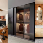
Material Palette: Dark Wood, Leather, Velvet
Dark walnut or espresso wood anchors the story. Speakeasy interior design needs one dominant wood tone repeated on tables and shelving.
Leather or velvet on seating adds touch luxury. I choose matte leather over glossy vinyl every time.
Metal appears as aged brass or iron, sparingly. Bar cart brass is enough; brass everything is nightclub.
Stone or marble tops on small tables catch lamp pools and feel substantial. Laminate rarely reads right in low light.
When I apply Material Palette: Dark Wood, Leather, Velvet in my Austin rental, speakeasy interior design should feel easier to maintain, not harder to explain. I walk the path with laundry, groceries, or work gear because speakeasy interior design has to survive real life, not an empty showroom walkthrough.
Acoustic Hush and Rug Strategy
Hard surfaces bounce voices. Speakeasy interior design needs rug coverage under seating zones, wall textiles, or upholstered panels in larger rooms.
I use a rug large enough that front legs of all seating sit on it. Floating small rugs look like coasters under furniture.
Heavy curtains do double duty: light control at odd hours and sound soak for street noise.
Record players and books add quiet texture without requiring conversation about themselves.
When I apply Acoustic Hush and Rug Strategy in my Austin rental, speakeasy interior design should feel easier to maintain, not harder to explain. I ask one honest friend to sit for ten minutes and name the first object they notice. If it is not the focal point I planned, I edit before spending more.
Bar Zone Without Theme Park Props
A discrete cart or closed cabinet stores bottles and tools. Open bottle shrines read college, not lounge.
Mirror behind shelves can amplify glow if angled to reflect lamps, not windows. Direct window mirror creates glare.
Glassware lives behind doors or on one tray. Visual clutter fights intimacy.
If you browse interior design styles, compare speakeasy to art deco overlap. Pick one dominant era cue per room.
When I apply Bar Zone Without Theme Park Props in my Austin rental, speakeasy interior design should feel easier to maintain, not harder to explain. I keep a short notes list on my phone: what worked, what annoyed me, what I would repeat. That list beats impulse buys when the room drifts.
Rental and Safety Reality
Candles need stable holders and clear distance from textiles. LED pillar candles give mood without lease anxiety.
Smoke detectors stay functional even when you chase moody darkness. Test monthly.
Ventilation matters if you cook smoky snacks for guests. Speakeasy interior design is not stale air and perfume coverup.
Furniture placement must still clear egress paths. Intimate cannot mean blocked exits.
When I apply Rental and Safety Reality in my Austin rental, speakeasy interior design should feel easier to maintain, not harder to explain. I test the change for a full week of normal routines, not a weekend photo session. If bags, mail, or dishes break the calm, the layout still needs editing before I shop again.
Ceiling Height and Fixture Drop Math
Speakeasy interior design in eight-foot rooms needs semi-flush fixtures with wide shade diameter instead of long drops. I measure seated head height plus six inches clearance minimum.
Over-bar pendants belong above work surface, not walkway. Height is measured from counter, not ceiling alone.
Picture lights and shelf lip LEDs add mid-level glow without lowering ceiling visually.
Paint ceiling slightly darker than walls in tall rooms to pull intimacy down from void air.
When I apply Ceiling Height and Fixture Drop Math in my Austin rental, speakeasy interior design should feel easier to maintain, not harder to explain. I photograph the room at the same hour for three days so shifting light does not trick me into false confidence about materials or scale.
Texture Underfoot and Hand
Velvet pillows and leather arms invite touch. Speakeasy interior design should feel tactile in low light, not just look dark in photos.
Worn oriental patterns hide spills better than solid cream in hosting zones.
Brass bar tools should be real weight metal, not hollow tin that tips on first shake.
Napkin and coaster discipline protects wood tables from ring stories you did not want.
When I apply Texture Underfoot and Hand in my Austin rental, speakeasy interior design should feel easier to maintain, not harder to explain. I walk the path with laundry, groceries, or work gear because speakeasy interior design has to survive real life, not an empty showroom walkthrough.
Music and Media Without Breaking Mood
Speakers hidden in bookshelves keep technology quiet. Visible sound bars fight 1920s story unless styled into cabinet.
Vinyl setup can anchor one wall if cables managed and dust cover used daily.
TV behind art lift or in armoire preserves lounge when not game night.
Playlist volume stays conversation-level. Loud bass kills intimate speakeasy interior design fast.
When I apply Music and Media Without Breaking Mood in my Austin rental, speakeasy interior design should feel easier to maintain, not harder to explain. I ask one honest friend to sit for ten minutes and name the first object they notice. If it is not the focal point I planned, I edit before spending more.
Seasonal Hosting Checklist
Before guests: dim presets tested, coat zone cleared, one extra seat plan, ice and glassware staged.
After guests: candles snuffed, windows cracked for air reset.
Rotate strong scents out after party so room returns neutral by morning.
Start with design basics if seating still feels wrong before buying more brass.
When I apply Seasonal Hosting Checklist in my Austin rental, speakeasy interior design should feel easier to maintain, not harder to explain. I keep a short notes list on my phone: what worked, what annoyed me, what I would repeat. That list beats impulse buys when the room drifts.
Speakeasy interior design is dim warm light, close seating, and rich materials edited to human scale. Skip neon clichés, dim the ceiling, and pull chairs inward.
Host a two-person test night before a party. If you need to shout, add textiles and lower light sources before you buy more decor. See home decor when you want adjacent ideas.
FAQ
Do I need a bar cart?
Helpful but not required. A closed cabinet with lamp on top works.
How dark is too dark?
If you cannot read a menu comfortably, add table pools. Mood still needs function.
Can small apartments do speakeasy?
Yes with one seating zone, one rug, and layered lamps. Edit scale down.
Best bulb temperature?
2200K to 2700K dimmed. Test skin tones with guests, not alone.
What to avoid?
Neon signs, glossy black everywhere, and seating too far apart for talk.